Aura Coffee Branding Project

BRIEF
Aura Coffee is a branding project focused on developing a mobile app for a local coffee shop. The main objective of this project is to provide customers with a seamless and convenient way to order their favorite coffee.
The project started with conceptualization/ideation and in-depth research. These initial stages allowed me to gather insights and understand the unique requirements and preferences of both the coffee shop and its target customers. With this knowledge, I implemented effective branding strategies as well as applied creative techniques to the visual and UI design process.
The outcome of these efforts is a set of high-fidelity app screens, which are showcased later in this case study. By integrating branding principles and innovative design elements, the app offers an intuitive and user-friendly interface. Customers can easily navigate through the app, explore the menu, personalize their coffee orders, and conveniently complete their orders.
PROJECT INCLUDED
UX Research | Branding | Graphic/Visual Design | UI Design | Prototyping
UX RESEARCH
To gain a comprehensive understanding of the current coffee shop market, extensive research was conducted at the outset of the project. This research involved studying the existing coffee shops in the local area as well as analyzing the competition within the industry.
By learning the current landscape of coffee shops, valuable research were obtained regarding industry trends, customer preferences, and motivations of customers. This research also highlights the strengths and weaknesses of competitors, providing important lessons and opportunities for improvement.
“Competitive Analysis”
Knowing the competitors’ strengths and weaknesses could have a better understanding and clear goals for developing projects. I did a bunch of research on coffee shops in Toronto and picked two as main competitors as well as assessed why those two coffee shops are quite successful. I went through their websites and read customer reviews, and both coffee shops have shown their own stories instead of just selling coffee and products. The goals are mainly creating the most unique environments, sharing their own stories, and letting customers experience premium coffee filled with passion and enthusiasm.
Understanding the strengths and weaknesses of competitors is essential for developing successful projects. In the case study, extensive research was conducted on coffee shops in Toronto, with a focus on three main competitors - De Mello Palheta, Rooster Coffee & Neo Coffee Bar. The research involved analyzing their websites, reading customer reviews, and studying their overall brand narratives.
It was observed that these three coffee shops stood out in the market not only for their coffee offerings but also for the unique experiences they provided to their customers. Rather than solely focusing on selling coffee and products, these coffee shops emphasized creating distinctive environments and sharing their own stories. This approach aimed to engage customers on a higher level, allowing them to connect with the brand and its values.
The goals identified from this research were centered around creating a unique environment within Aura Coffee, sharing the brand's own story, and providing customers with a unique coffee experience filled with passion and enthusiasm. By understanding the successful elements of these competitors, Aura Coffee aims to incorporate similar strategies into its branding and overall customer experience.


“Personas”
Understanding the target audience is fundamental when it comes to creating outstanding products for a coffee shop. User personas is a great tool for finding the answer to the essential question, "Who are we designing for?" By delving into the expectations, concerns, and motivations of the target customers, it becomes possible to design a product that effectively meets their needs, resulting in a successful outcome.
Using personas in the design process offers several benefits:
Personas help to create understanding and empathy with the end-users.
Personas provide direction: A deep understanding of customers' behavior and needs allows us to define the target audience and create a user-centered product. By gaining insights into the preferences, motivations, and pain points of users, I can identify what is necessary and unnecessary from their perspective.
After conducting research and informal interviews, I have developed three distinct personas that represent different types of users:


BRANDING
After gathering extensive information from previous research, I initiated the branding ideation process for the coffee shop project. This stage involved developing the overall branding concept, including elements such as the brand name, goals, promises, and essential UI kits.
“Ideation - Brainstorm”
During the ideation phase, I conducted brainstorming techniques to generate a wide range of coffee-related concepts and ideas. I used sticky notes to write down every coffee-related term, word, or concept that came to mind.
“Mood Boards”
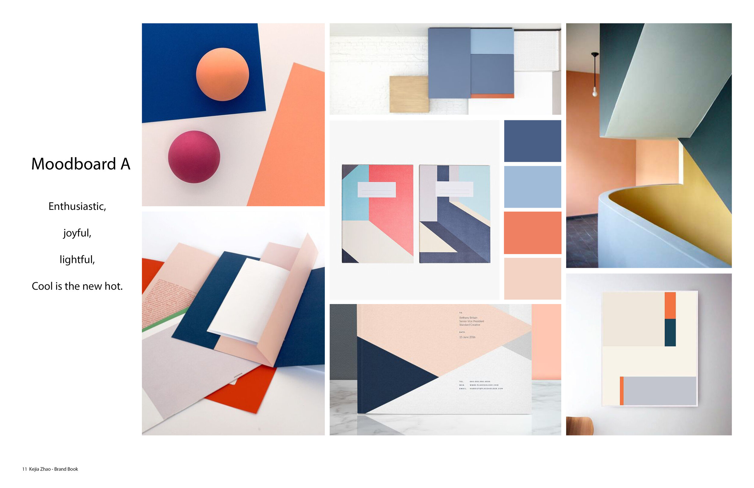
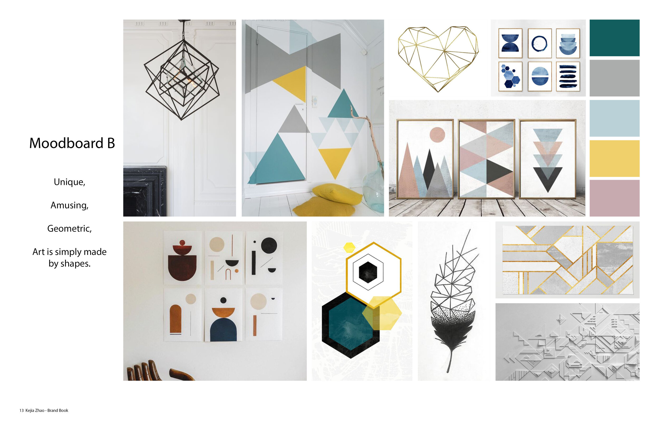
I created three mood boards to show different directions of the exploration of design. The first one was color block and shapes, the second one was geometric art and minimalism, and the third one only focused on minimalism. The final decision of design direction was the combination of mood boards A and B as it demonstrated how shape elements and color block could be well integrated.
I created three mood boards to visually represent different directions for the brand's design. The first mood board, labeled as "A," showcased a design approach characterized by color blocks and distinct shapes. his direction aimed to create visual contrast and aesthetic.
The second mood board, labeled as "B," focused on geometric art and minimalism. It emphasized clean lines, simple shapes, and a minimalistic color palette. This direction aimed to convey a sense of modernity.
The third mood board, labeled as "C," centered solely on minimalism. It emphasized simplicity, whitespace, and a pared-down visual style.
After carefully reviewing and analyzing the three mood boards, I made the decision to combine the design elements from mood boards A and B. This decision was based on the idea that integrating shape elements and color blocks would create a visually unique brand identity.

“Brand Name & Goals & Promise”
'AURA' Coffee draws inspiration from its name, which means a distinct quality or ambiance associated with a person, place, or thing. In the case of Aura Coffee, the focus is on creating a unique and exceptional coffee experience.
Life begins after coffee, and Aura Coffee aims to be a coffee oasis away from the hustle of downtown Toronto.
Aura Coffee aims to serve a serene and relaxing coffee experience. Handmade coffee and other specialty beverages are crafted with care and precision. The goal is to create a moment of peace for customers, offering them a comfortable and quiet corner to enjoy their own time.
GRAPHIC/VISUAL DESIGN
Logo | Color Palette | Typography | Icons
The chosen design style for Aura Coffee was centered around simplicity, minimalism, and a focus on shapes and lines.
The logo design reflected this approach by simplifying the word "AURA" into a clean and easily readable typography. The letter "U" in the logo was filled to represent the word "Coffee," creating a visual connection to the coffee aspect of the brand.
To establish a cohesive visual identity, a color palette was selected. The main colors included dark navy (#212F46), true orange (#EE7162), light nude pink (#F9E4DE), and white (#FFFFFF).
In terms of typography, the Century Gothic Regular/Bold font was selected for titles and body text. This font choice aligns with the overall minimalistic and modern aesthetic of the brand, ensuring clear and legible communication across various design elements.

Typography - Century Gothic

Color Palette

Signage Mockup

Signage Mockup
LOW - FIDELITY UI - WIREFRAMES
The development of wireframes is an important step in the design process, with a primary focus on functionality and information hierarchy rather than visual aesthetics. By creating wireframes, I was able to address functional and navigational issues in a flexible manner, allowing me to prioritize the quality of the user experience and user flow without the distractions of color, fonts, and other decorative elements.
While I didn't create wireframes for every single page, I prioritized key pages such as the login, home, product detail, profile, reward, and review pages. These pages were essential in demonstrating the core functionalities and interactions of the app, ensuring a seamless and intuitive user experience.

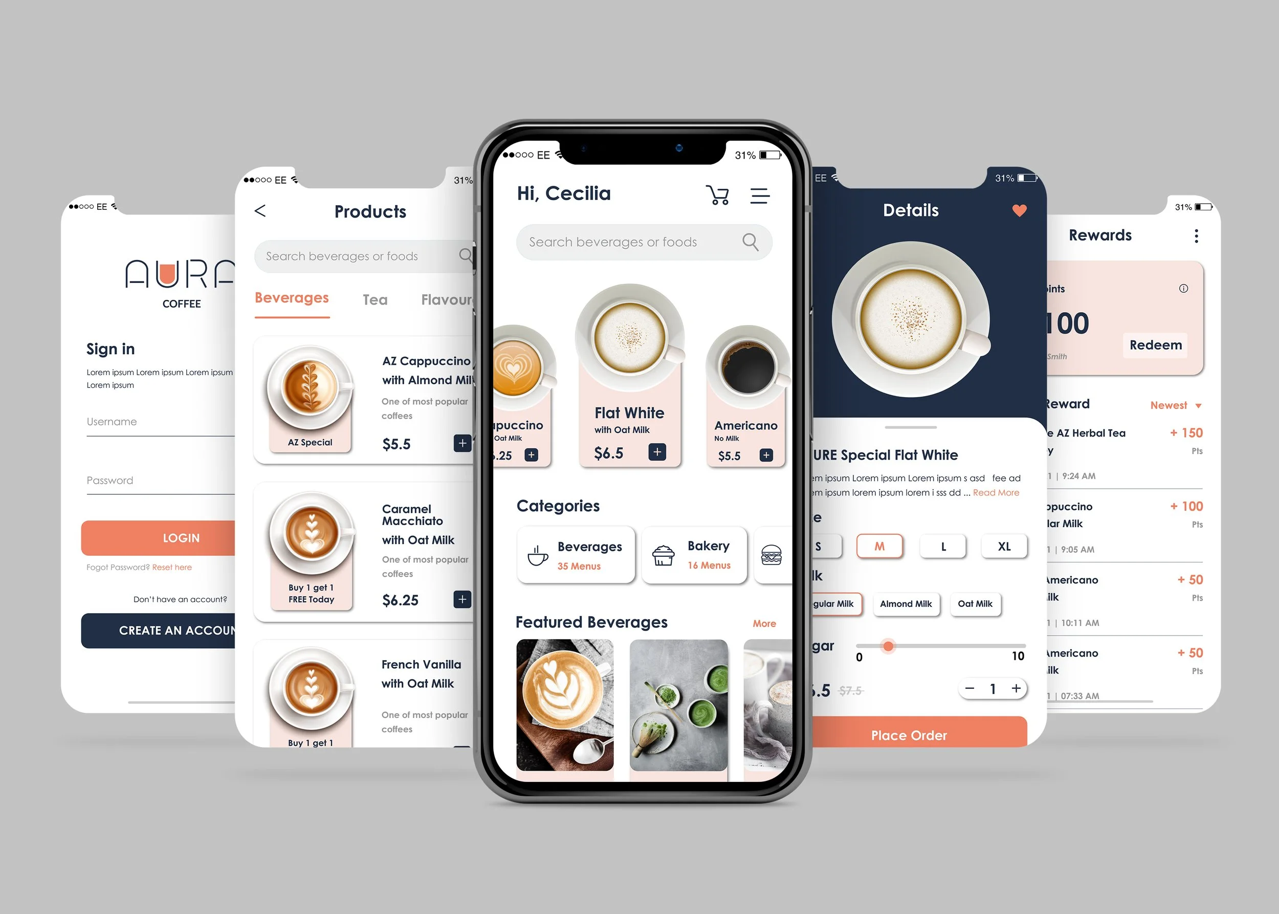
HIGH - FIDELITY UI DESIGN
The high-fidelity (hi-fi) UI design includes both the visual aspects and user experience (UX) considerations of the product. It aims to provide a detailed and accurate graphical representation of the product, allowing for thorough testing and evaluation of various aspects such as UI components, colors, layouts, information hierarchy, user mental load, and interactive elements.
During the hi-fi UI design phase, I utilized the color palette, logo, and other essential UI elements to create major app screens. These screens included the loading page, sign-in/up pages, home page, product detail page, profile page, review page, and reward page. Each screen was designed with attention to detail, ensuring consistency and coherence across the entire app.


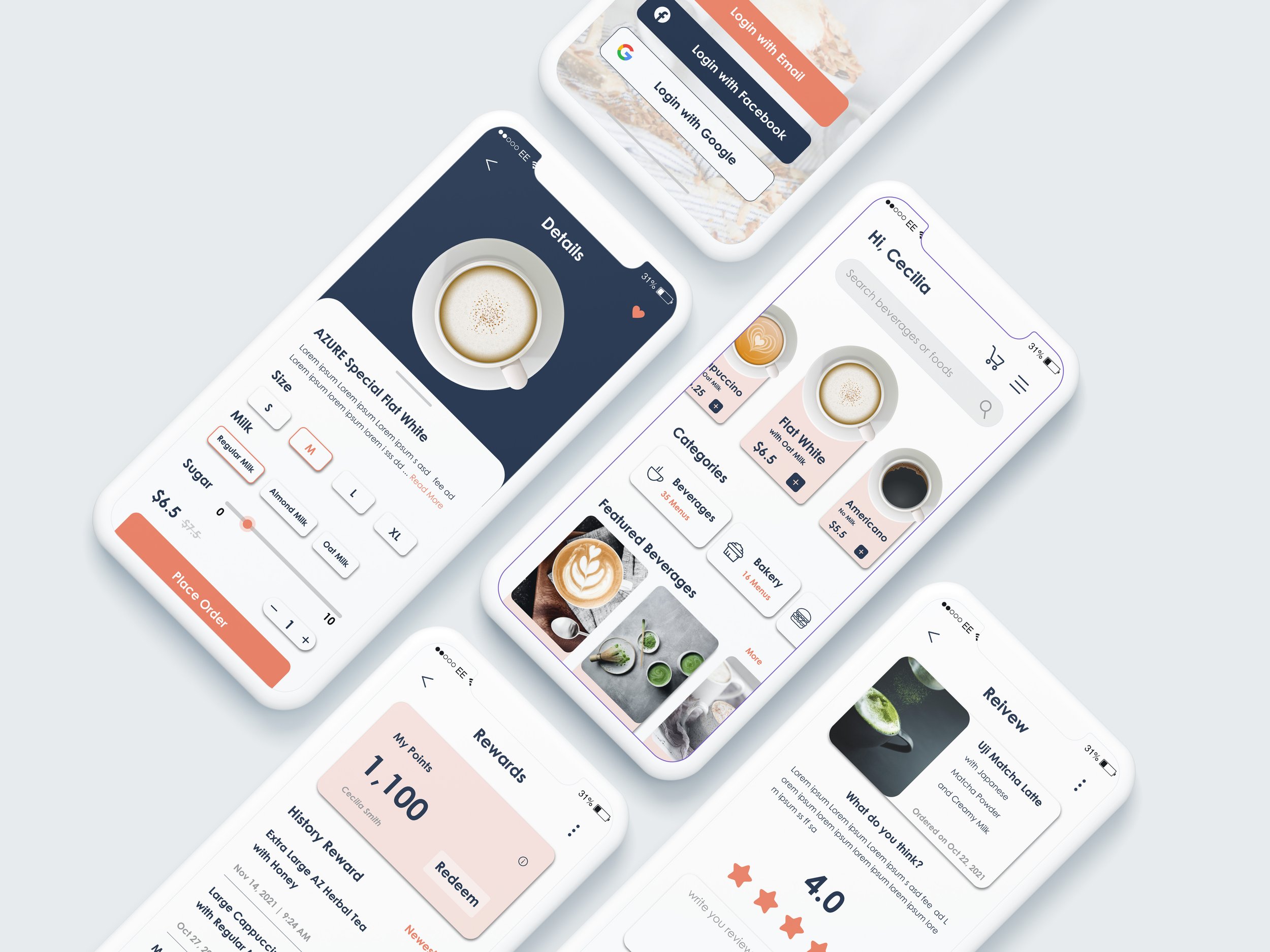
APP MOCKUPS
App mockups allow for revisions and refinements to the final appearance and functionality of the app. There is no way to create a perfect UX design without doing a mockup of the app.
By creating app mockups, I can gather valuable input and insights from other expertise. This feedback can be used to make necessary adjustments and enhancements before proceeding to the prototyping phase.


OUTCOMES
The Aura Coffee branding project involved a comprehensive range of activities, including designing, researching, applying design thinking, and utilizing relevant techniques and skills. It provided me with a valuable opportunity to go through the entire development and design process, starting from the initial concept to the final deliverables. This hands-on experience has enriched my skills and knowledge as a designer.
Throughout the project, I had the chance to conduct thorough research, gather insights, and analyze the coffee shop market. This research-driven approach helped me understand the industry trends, customer needs, and competitors' strategies. It allowed me to make informed design decisions and create a product that resonates with the target audience.
Moreover, the project allowed me to apply design thinking principles, such as ideation, prototyping, and user-centered design, to develop a compelling brand identity and user interface. By immersing myself in the design process, I gained practical experience in solving design challenges, refining user flows, and creating visually appealing and functional designs.
The Aura Coffee branding project was a stepping stone in my journey as a designer, providing me with the confidence and knowledge to take on future projects with greater expertise and creativity.