VirgoCX Design System
ABOUT VIRGOCX
VirgoCX is a Canadian cryptocurrency trading platform aiming to provide a secure, user-friendly experience for both new and advanced traders. As the company expanded its product offerings across web, app, and marketing channels, the need for a unified design foundation became critical.
MY ROLE
As a UI/UX Designer, I collaborated with the design lead, product manager, and developers to audit existing interfaces, establish a design system, and ensure consistency across platforms. My focus was on scalability, accessibility, and efficiency in the design-to-development workflow.
CONFIDENTIALITY
Due to company policies on privacy and confidentiality, I am unable to disclose full details of the work process or product-related projects. However, for this ongoing project, I can share examples of standardized components to demonstrate my understanding of design systems and showcase my skills as a designer, while still respecting company guidelines and maintaining confidentiality.
In this case study, I will walk you through the Component Library & Design System project.
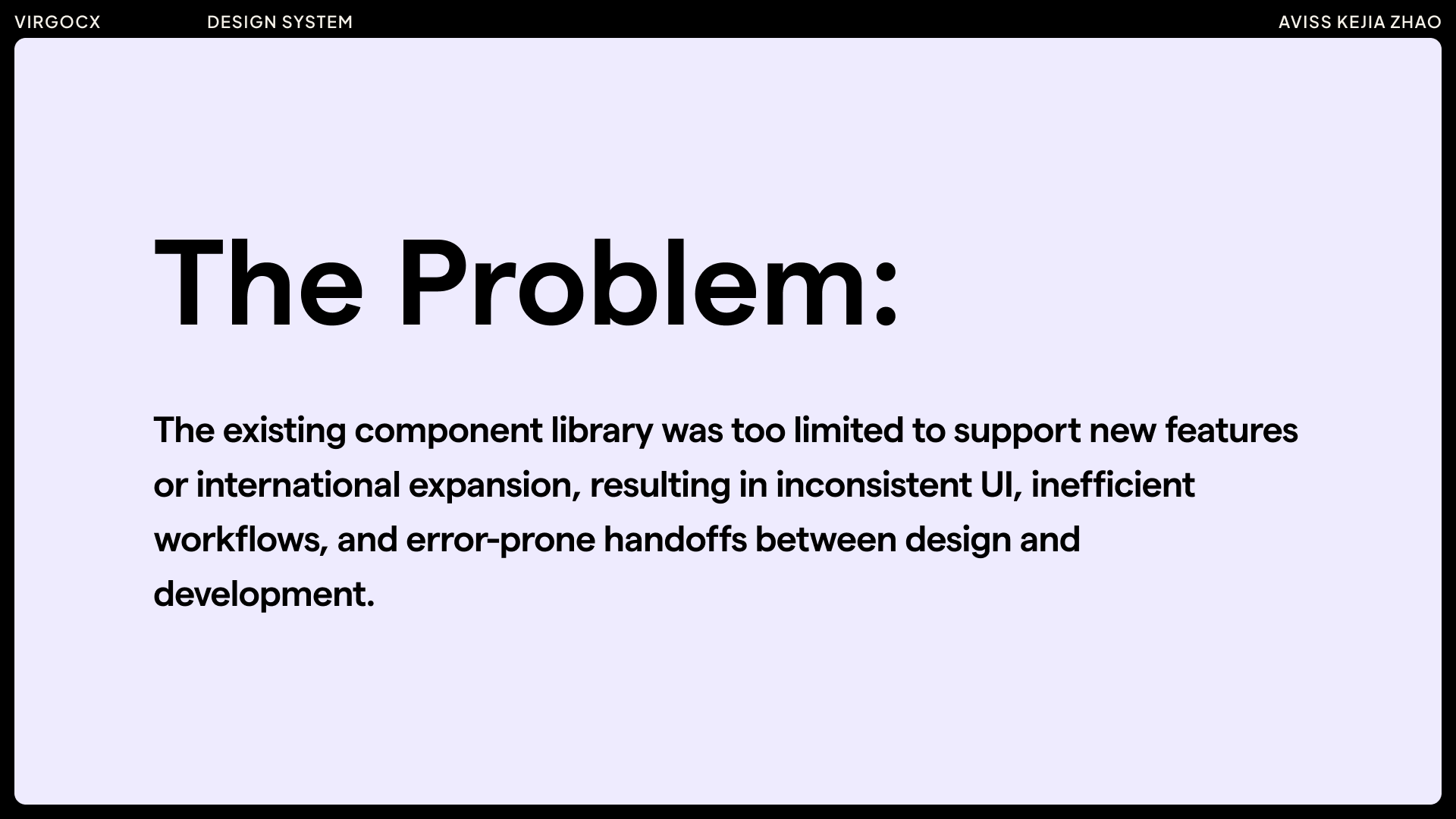
When I first joined VirgoCX, the team lacked a proper design system, which resulted in inconsistencies across products. I initiated and collaborated with the design lead to build a scalable design system from the ground up. This process included conducting a UI audit to identify existing patterns, consolidating reusable components, and defining naming conventions, states, and interaction behaviors. I also established guidelines for typography, color, spacing, and accessibility, and partnered with developers to ensure seamless implementation.
Alongside the system, I created the company’s logo variations for overseas business expansion, ensuring brand consistency across different markets.
The design system and brand assets not only streamlined collaboration between design and engineering but also reduced repeated work, improved visual consistency, and accelerated the rollout of new features and global initiatives.
THE PROBLEM
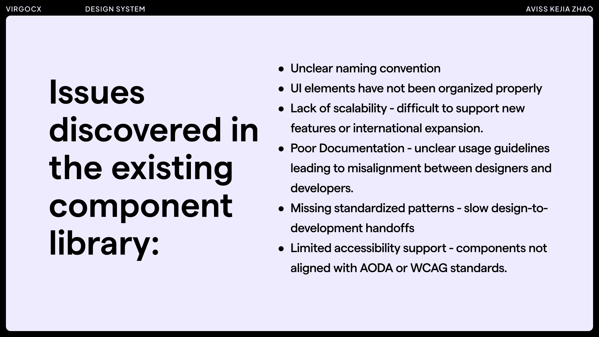
ISSUES DISCOVERED IN THE EXISTING COMPONENT LIBRARY
Examples of areas for improvement:
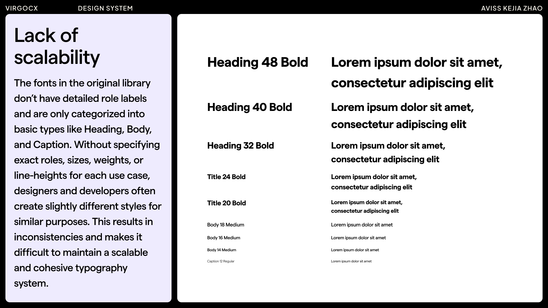


The examples highlighted above represent only a portion of the areas for improvement within the design system. Many additional aspects will need to be assessed and refined to ensure the system remains scalable, consistent, and supportive of future growth.
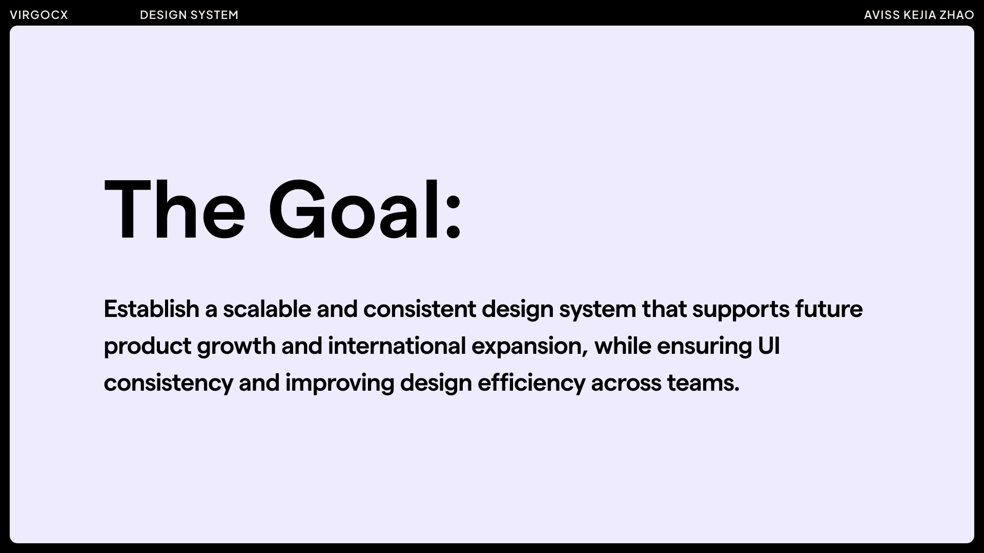
THE GOAL
RESEARCH & AUDIT
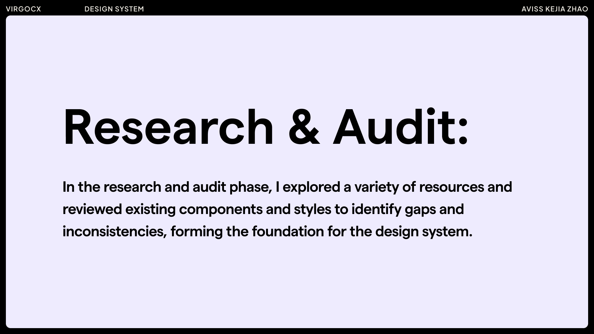
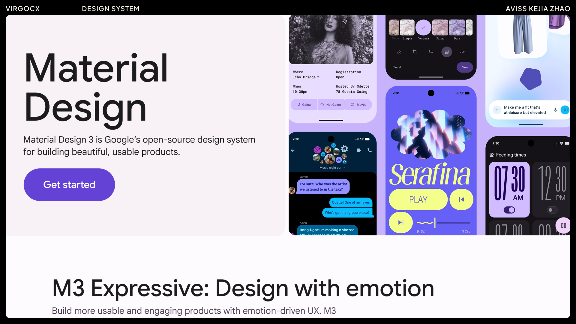
Since we were building the design system from the ground up, I spent this phase researching how successful design systems are structured and what key considerations make them effective. I explored a variety of resources, including Figma community examples and materials from the Interaction Design Foundation, taking notes on best practices and common pitfalls. Combining these practical and theoretical approaches helped me develop a strong understanding of how design systems work and how they should be built, providing a solid foundation for our own system.
Examples of some useful resources:
Next, I worked with the design lead to audit the existing products — reviewing components, typography, color usage, spacing, and layout patterns. Since we were building from the ground up, I mainly focused on organizing the core elements — colors, typography, spacing, and key components — which helped us highlight inconsistency and gaps across the product.
RESEARCH & AUDIT - ACCESSIBILITY
My approach to accessibility has two parts:
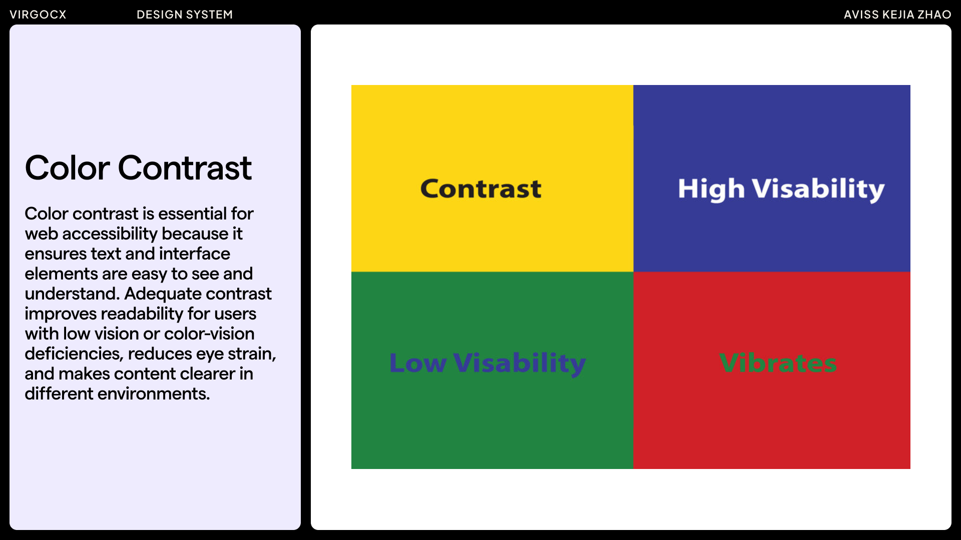
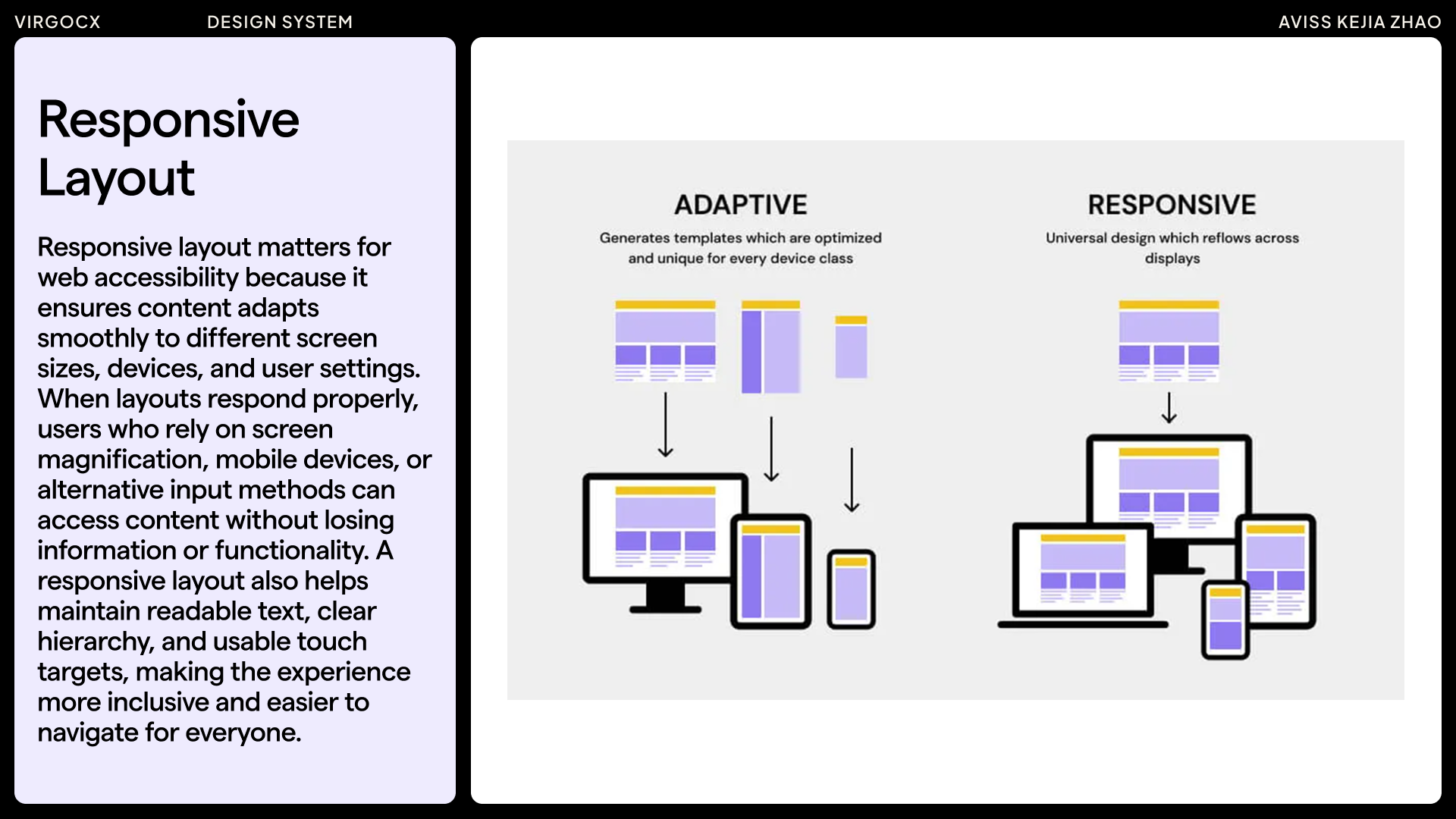
1. There are the general accessibility basics that apply to any digital product — things like color contrast, readable typography, font size, clear hierarchy, responsive layouts, and keyboard-friendly interactions. These make the product easier for everyone to use.
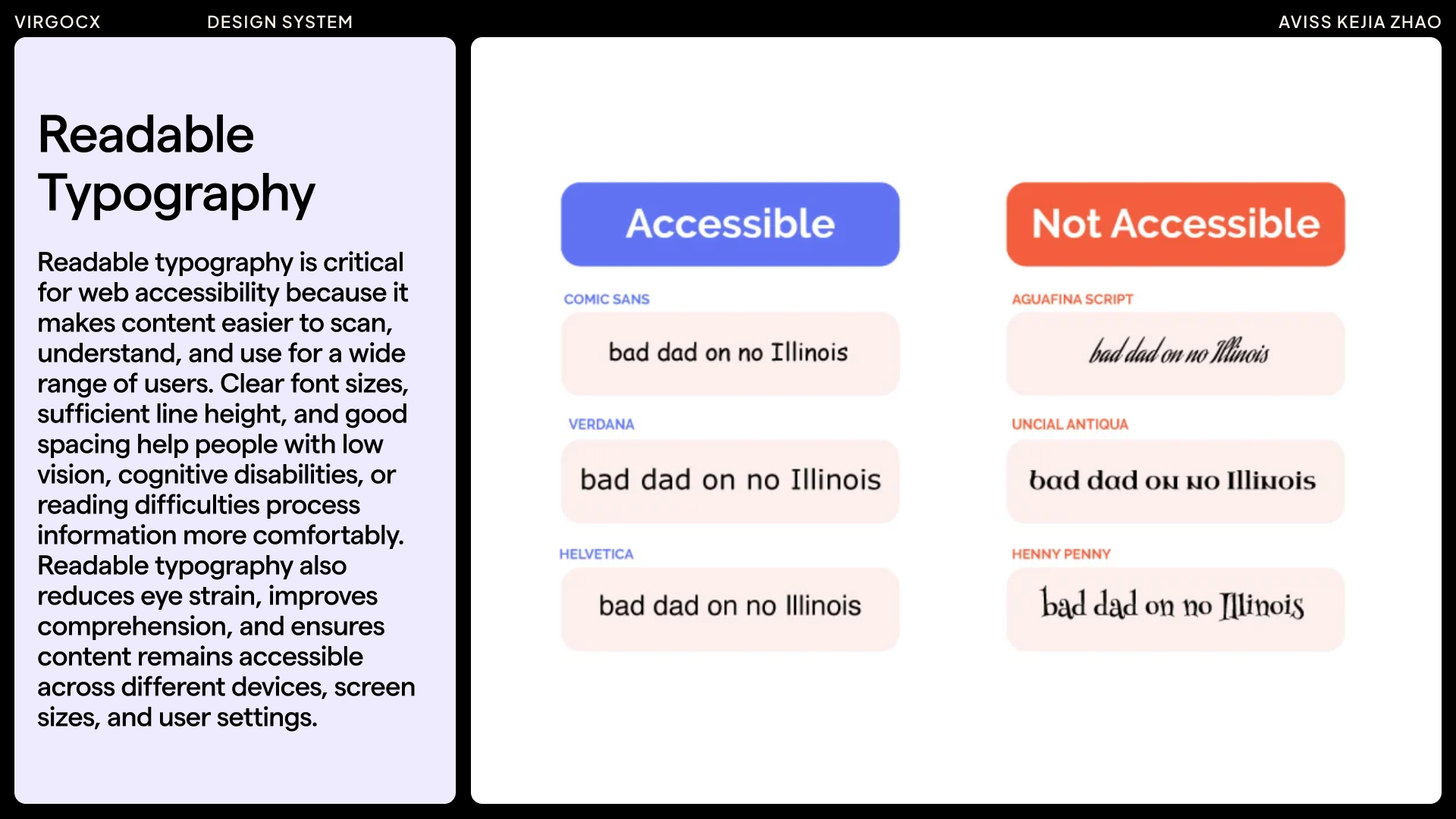
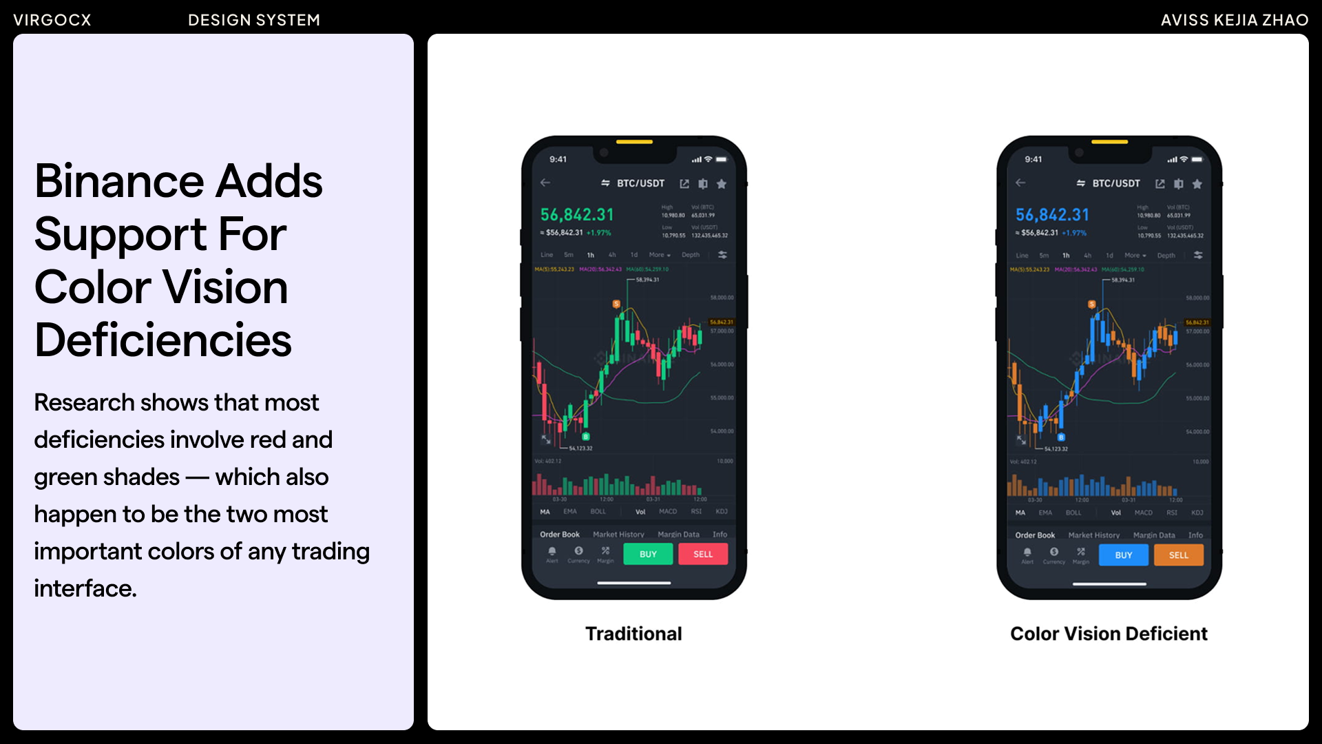
2. I look at accessibility in the context of the product. For example, when I was at VirgoCX, I noticed through competitive research that Binance had already started implementing accessibility features. In trading, most charts rely on a red–green color system, which makes it difficult for users with red-green color-vision deficiencies to interpret market signals accurately. So Binance even introduced a color-deficiency mode, which I think is a great example of inclusive design. Overall, I approach accessibility as something proactive, contextual, and essential to the design process.

In trading—whether stocks, crypto, or forex—red and green dominate the screen. Red indicates a price decrease, while green signals an increase over a selected time period. These colors are essential for spotting trends and visualizing portfolio performance, forming the basis of many critical trading decisions.
However, for individuals with red-green color vision deficiencies, these cues can be difficult to interpret. The two most common types are Deuteranopia (defects in the green cone) and Protanopia (defects in the red cone). In contrast, people with typical color vision have fully functioning red, green, and blue cones that allow them to distinguish these hues clearly.
This difference can have serious consequences. A color vision–deficient trader may misread a chart—such as mistaking a bearish trend for a bullish one—leading to costly, poorly timed trades. In a market like crypto, which moves rapidly and never sleeps, even a few seconds of hesitation or misinterpretation can create a significant disadvantage.
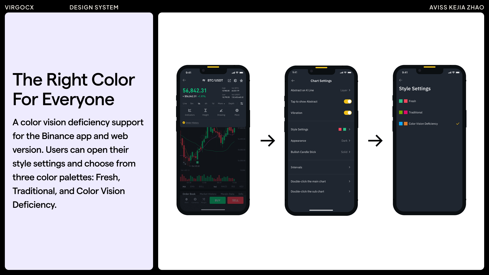
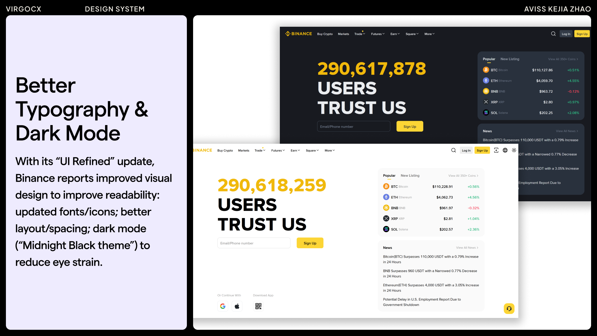
In my competitor analysis of Binance, I noted that their recent UI Refined update introduced improvements such as enhanced typography, dark mode, and customizable layout widgets, all of which support better readability and usability. They also included features addressing color vision deficiencies, an important consideration in trading platforms where red and green play a critical role. However, I found no clear evidence of full WCAG compliance, such as robust keyboard-only navigation or detailed accessibility support for screen readers.
Accessibility Consideration/Improvements
Drawing from these observations, I prioritized accessibility in the VirgoCX design system by focusing on readability (through font size and contrast), responsive design, and consideration of color vision deficiency modes —helping to fill these gaps and future-proof the product for a diverse range of users.

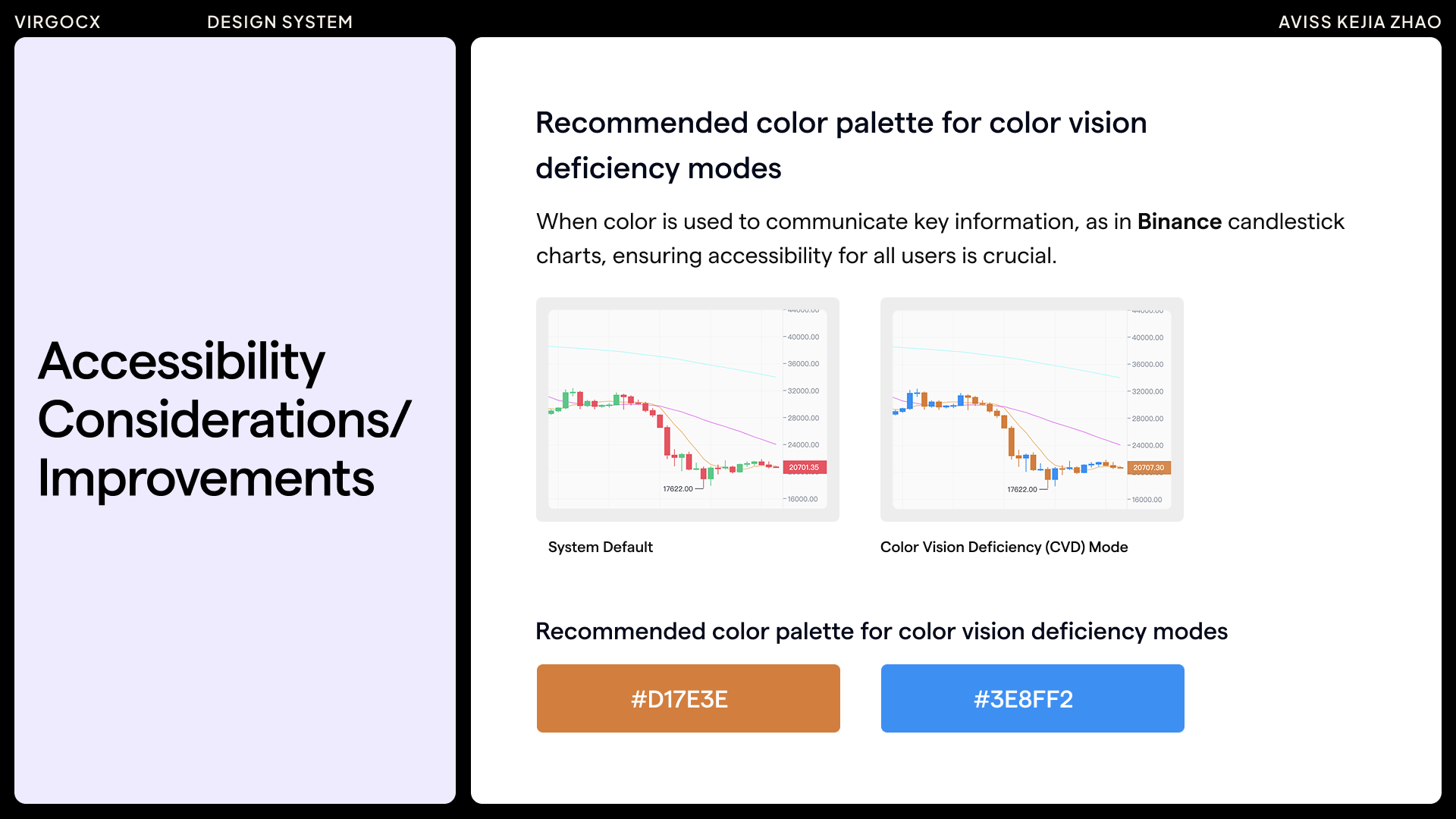
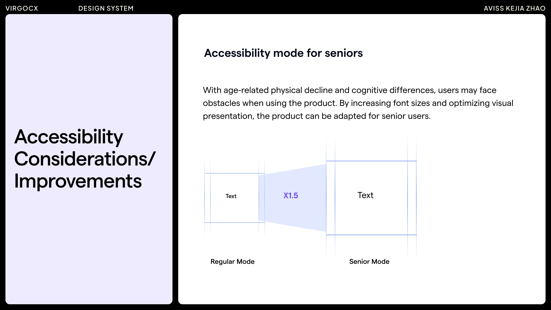
Based on research and competitor analysis, key accessibility considerations were identified for the design system. These included ensuring adequate color contrast, recommending color palettes suitable for color vision deficiency modes, and implementing a mode tailored for seniors, etc. all aimed at creating a more inclusive and user-friendly system. Accessibility is an ongoing effort, and there is always room to further incorporate improvements in the future.
Before & After: Tracking and Guiding Design System Components
To ensure consistency across the design system, I created a comprehensive table as a work guidance tool. It captured the initial state of each component, identified required improvements, documented the standardized redesign, and included a final quality and accessibility review. This approach not only ensured every element was systematically evaluated and aligned with design standards but also provided a clear foundation for new team members to onboard efficiently. Designed as a living reference, the table continues to guide ongoing updates and supports the future growth of the design system.
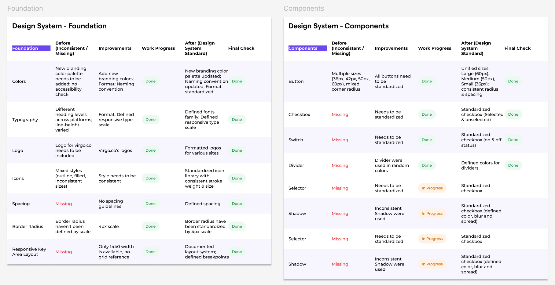
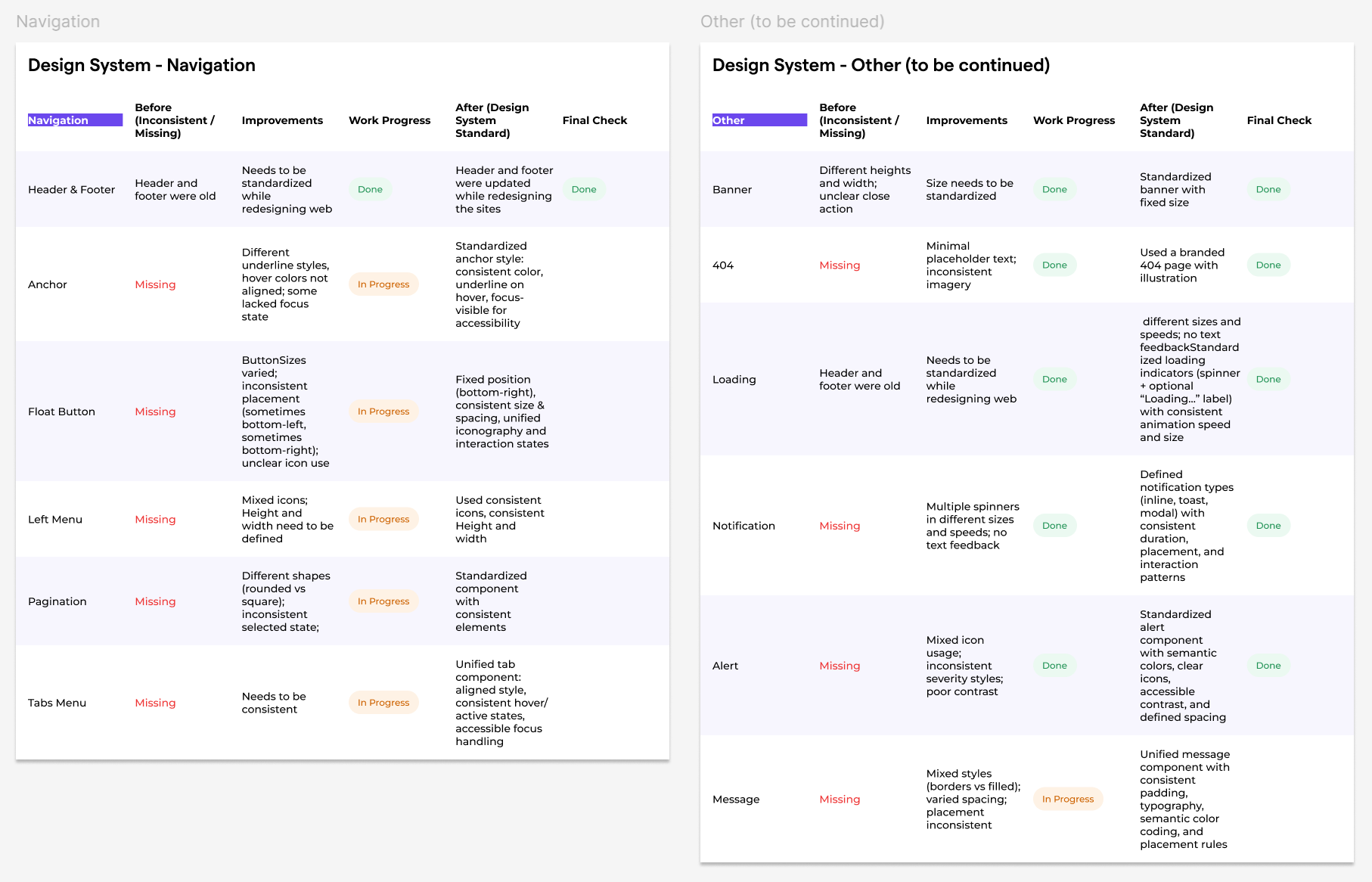
FOUNDATIONS & COMPONENTS:
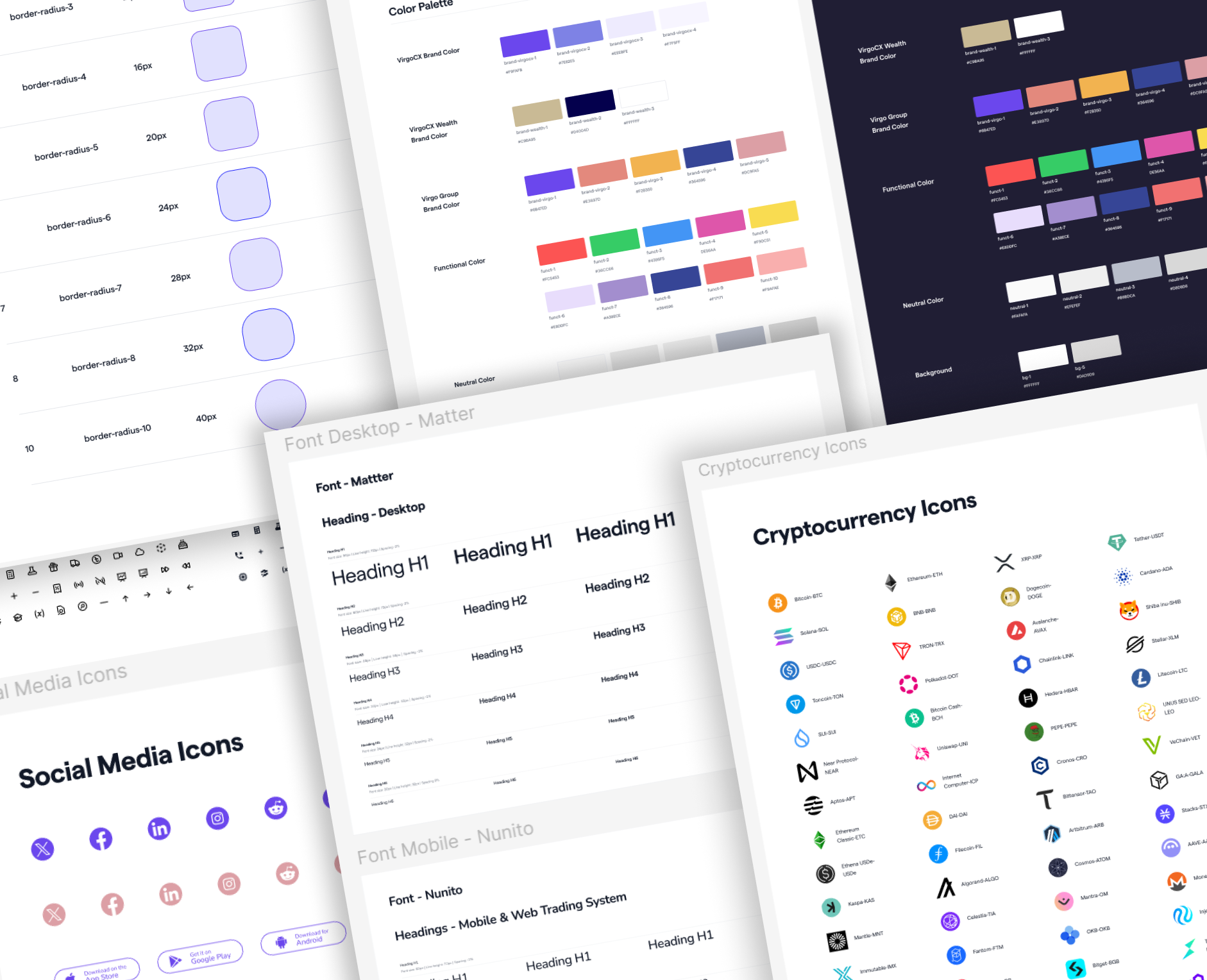
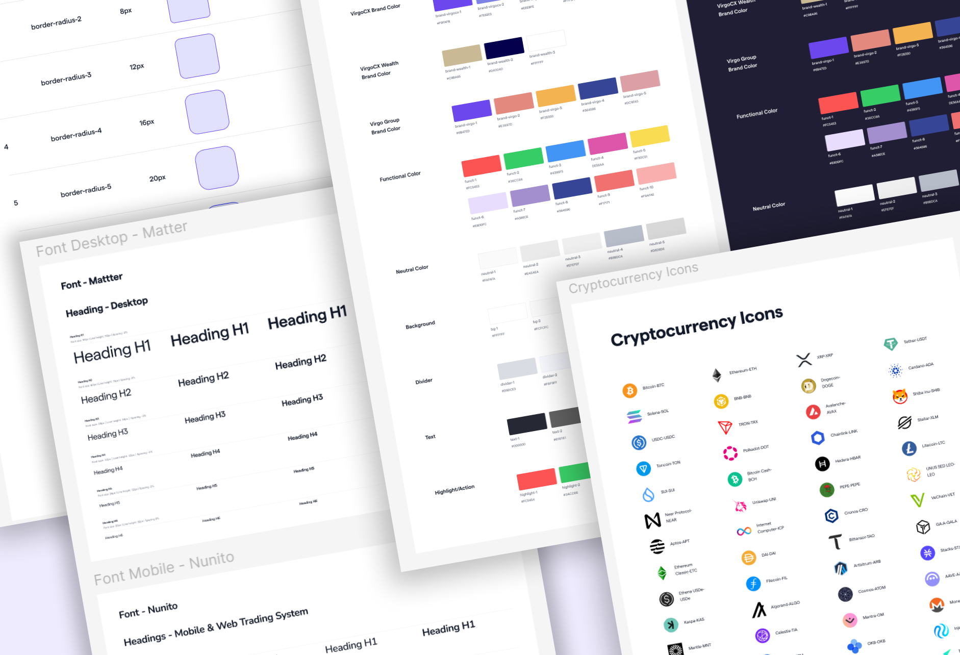
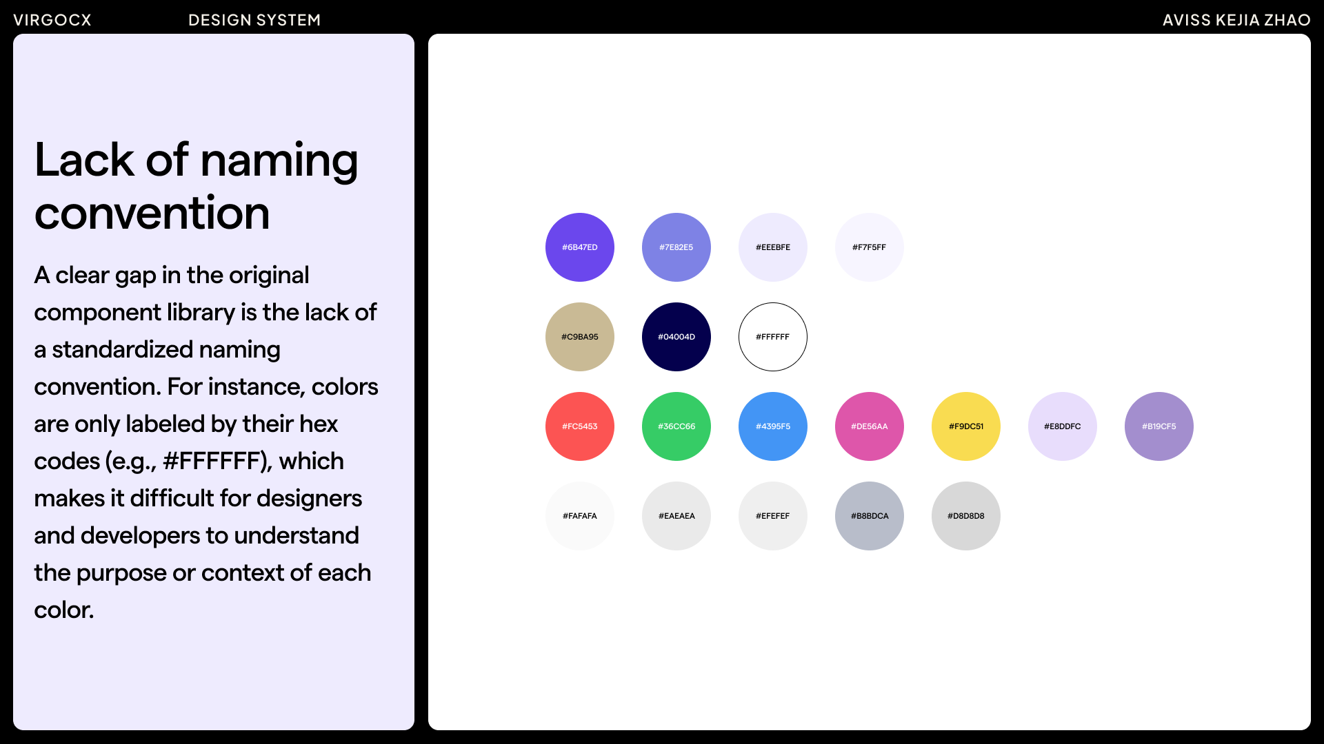
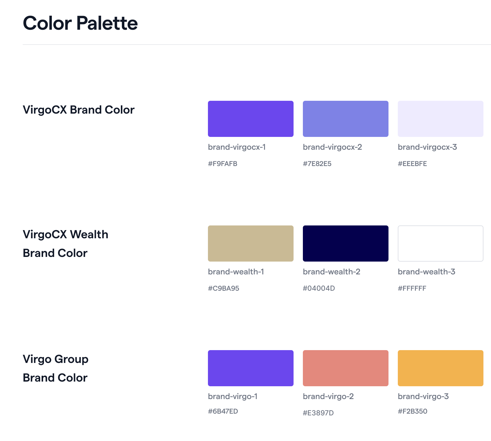
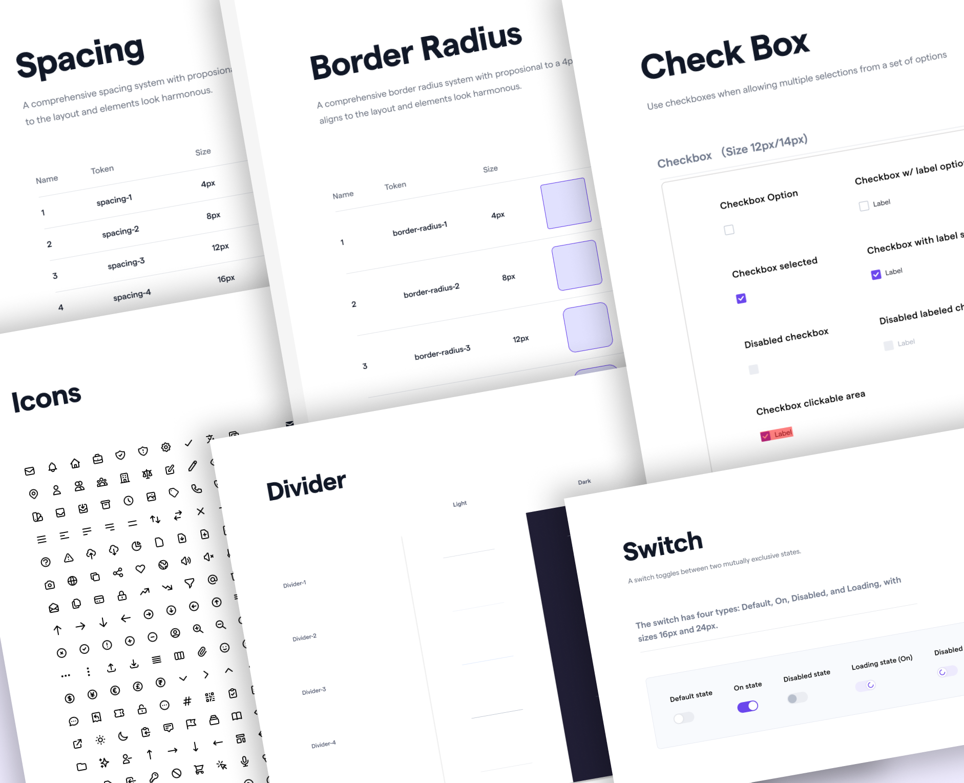
Colors
The first organized part of the design system was the color palette. When the company expanded overseas in 2022, Virgo Group introduced a new logo and brand colors, developed collaboratively by stakeholders and the design team. This provided the perfect opportunity to structure colors by function—for example, logo colors (VirgoCX for Canada and Virgo Group for overseas), functional colors, neutral tones, and background colors.
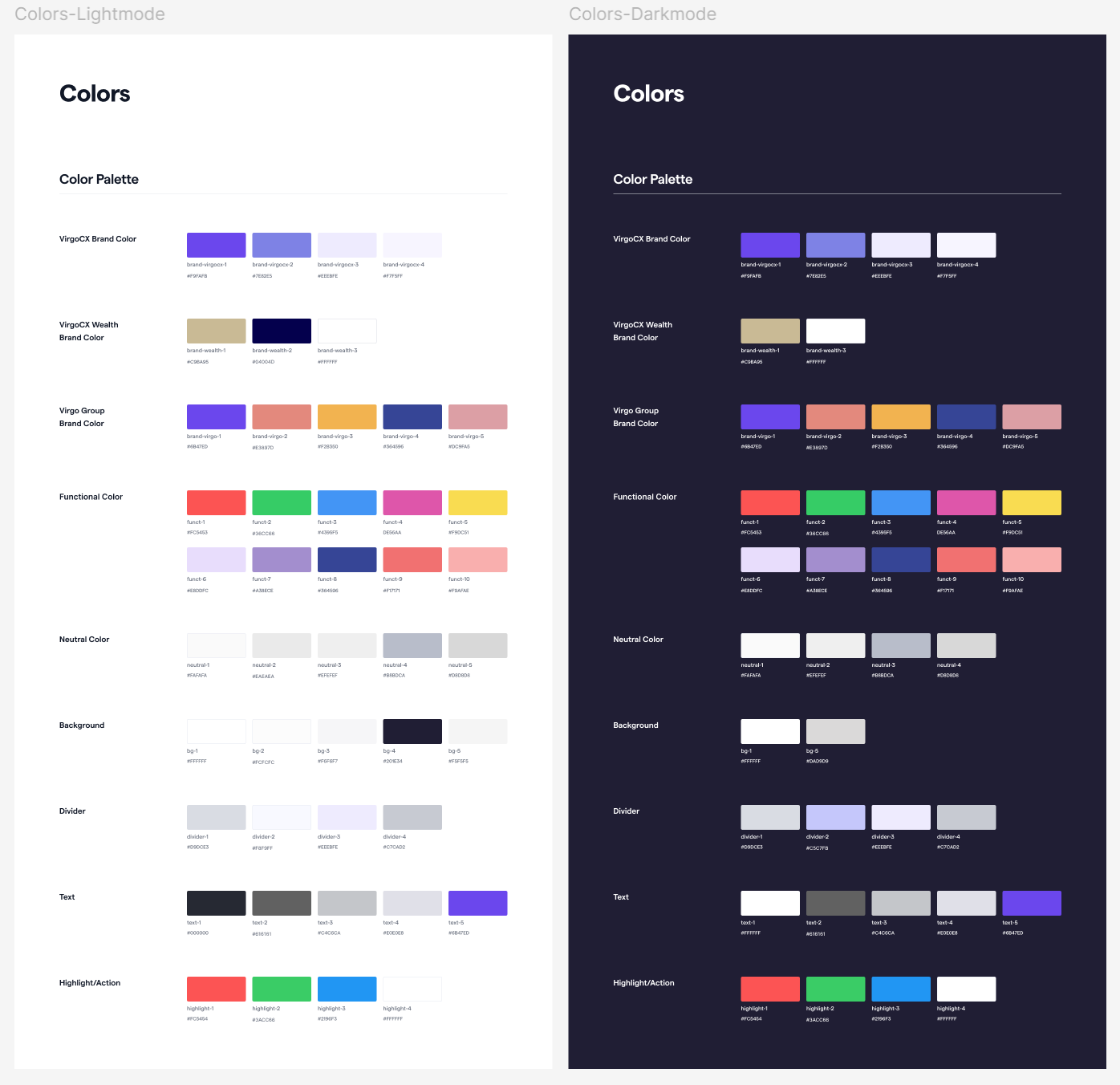
Most importantly, the colors were not only categorized by purpose, but also followed standardized naming conventions. This means that color names describe their function or usage rather than the color itself, making them easy for developers to understand and implement. In a design system, clear naming conventions help streamline collaboration between designers and developers.
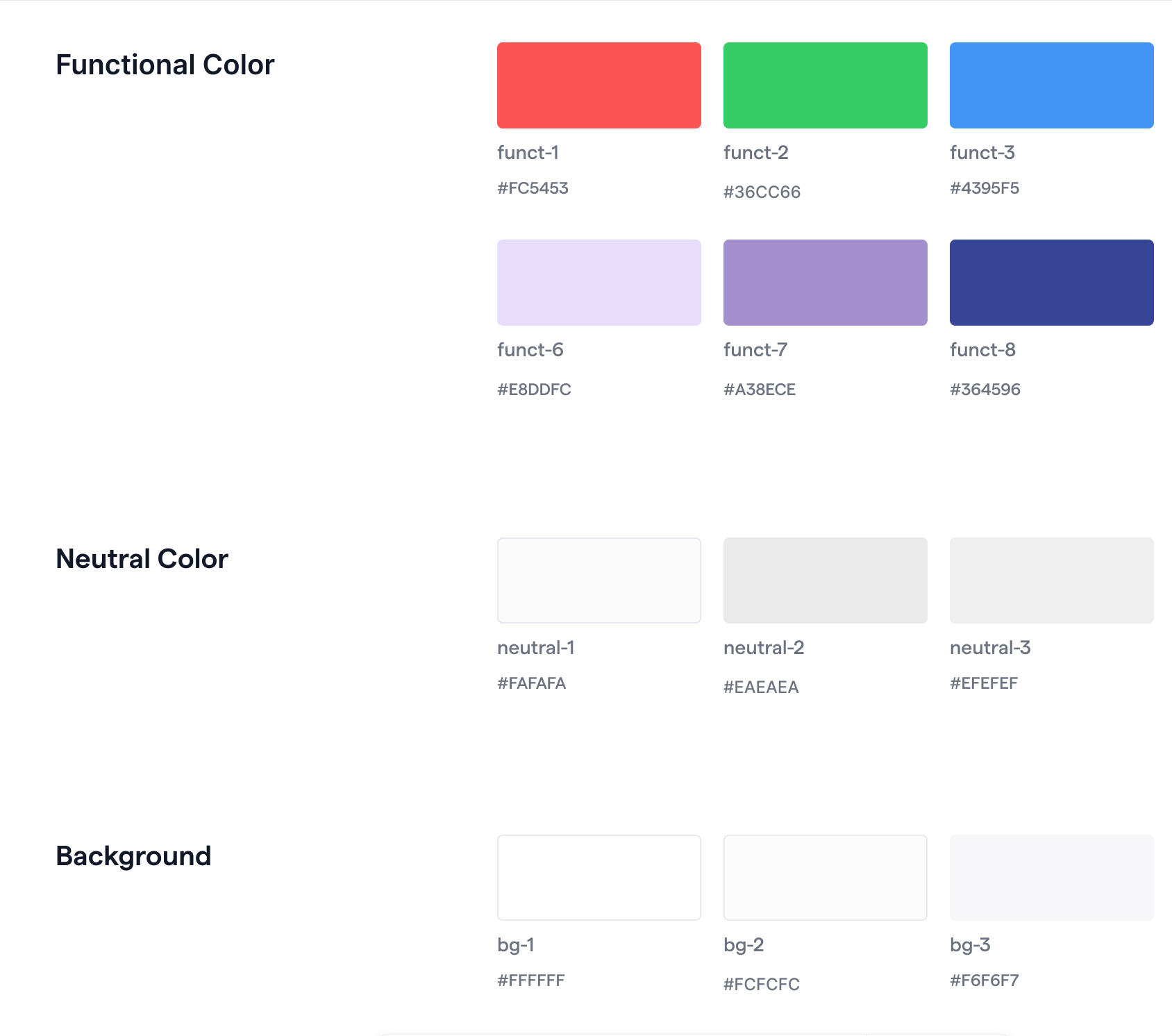
Later that year, with the launch of dark mode on the mobile app, we introduced the dark mode color palette.
This color foundation now anchors the design system and supports the scalability of future products.
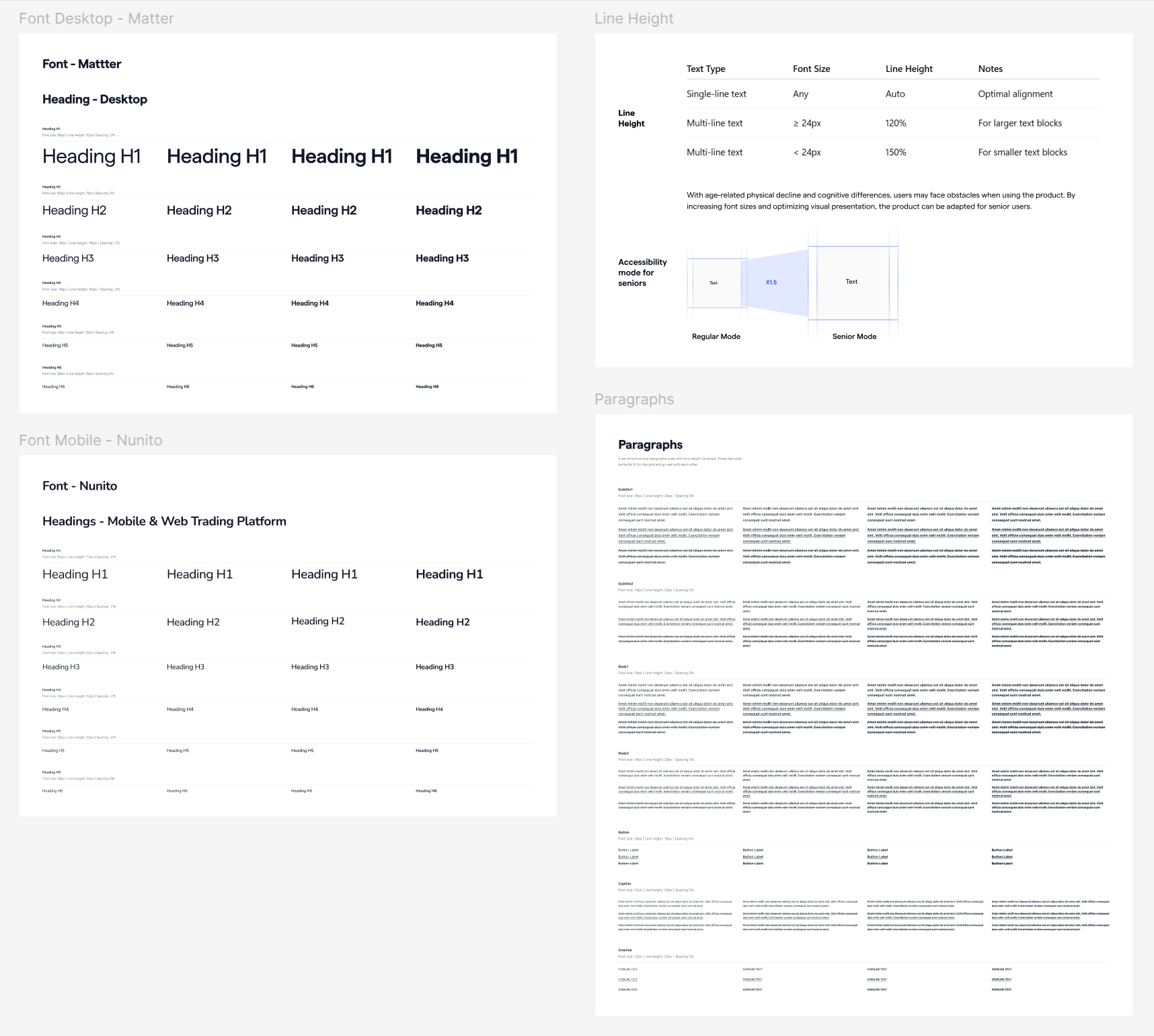
Typography
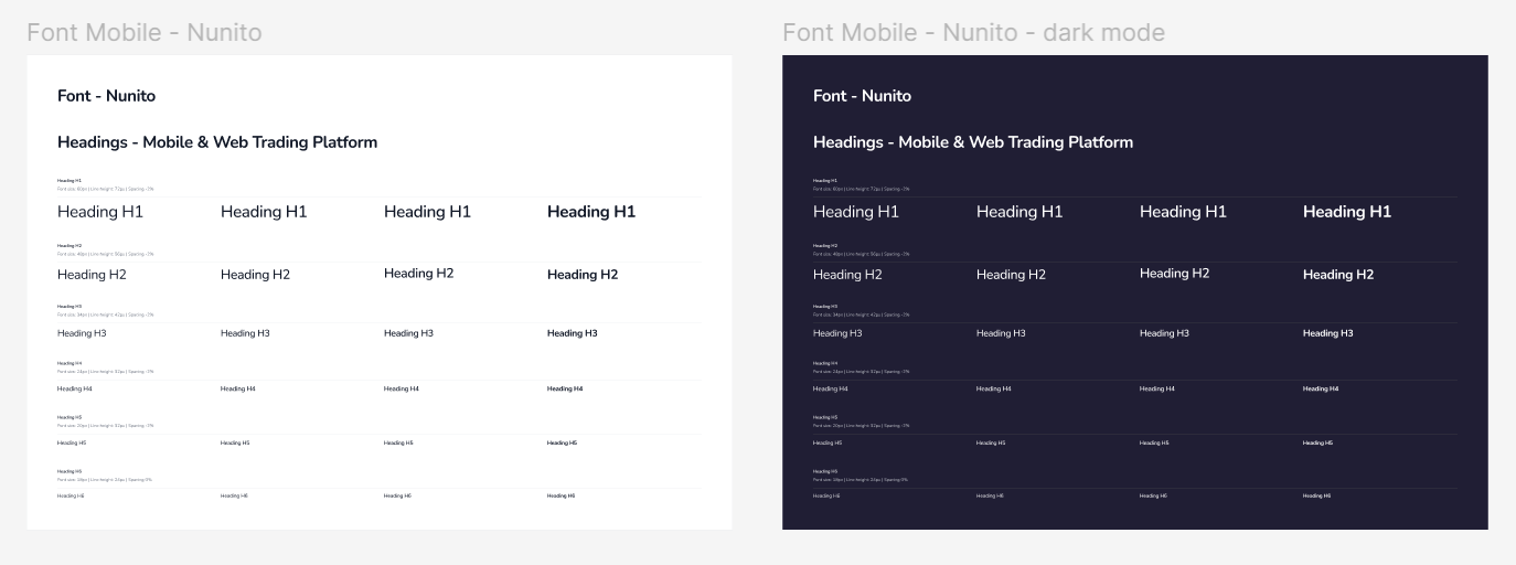
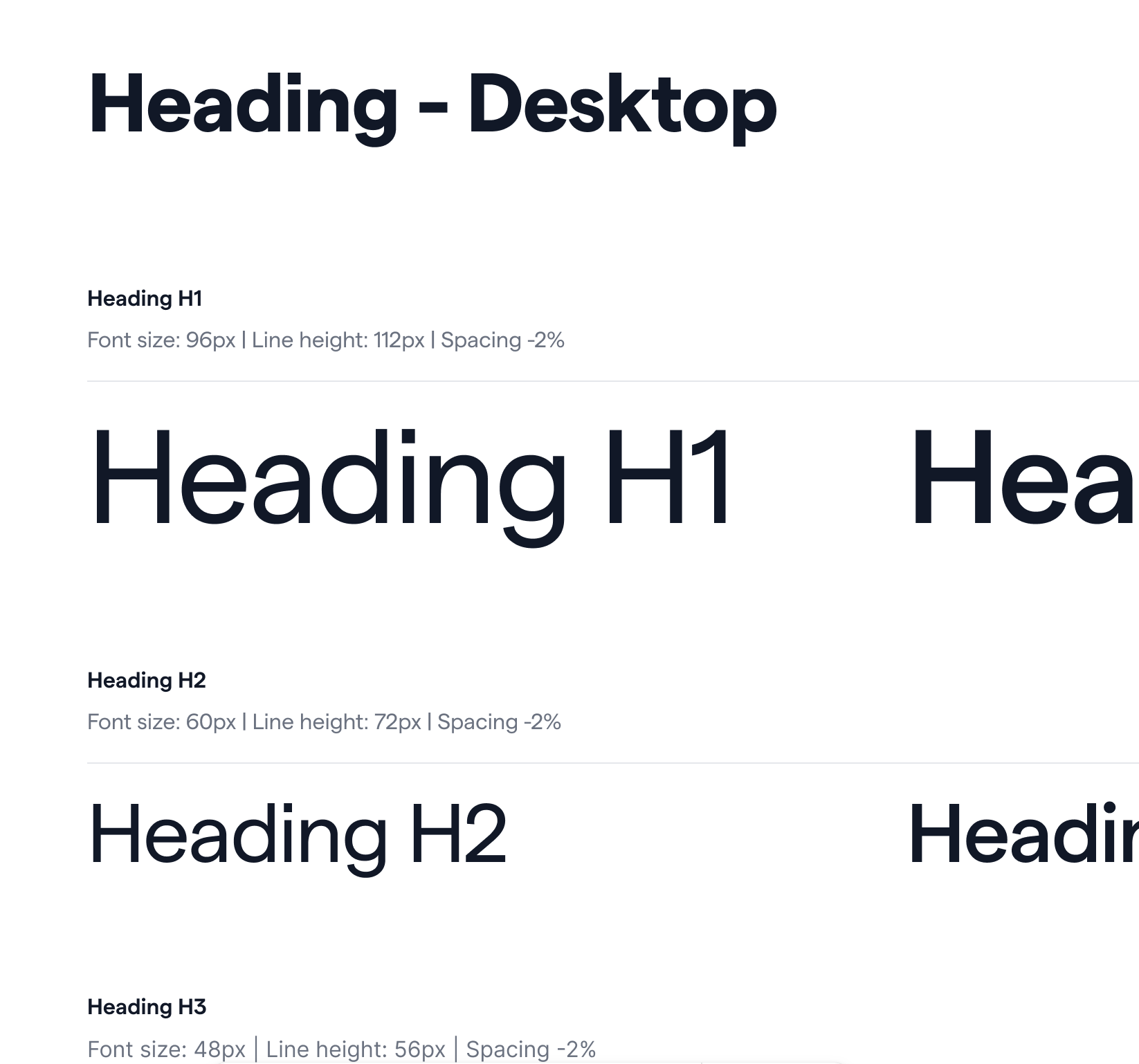
Typography was another key part of organizing the design system. To align with brand identity and platform needs, the Matter font family was chosen for the website, providing a clean and professional look, while the Nunito font family was applied across the mobile app and trading platform for its readability and friendly tone.
Beyond font selection, I established detailed guidelines covering heading hierarchies, font sizes, line heights, spacing ratios, and text treatments across different contexts. These standards ensure consistency, readability, and a cohesive typographic experience throughout the product.
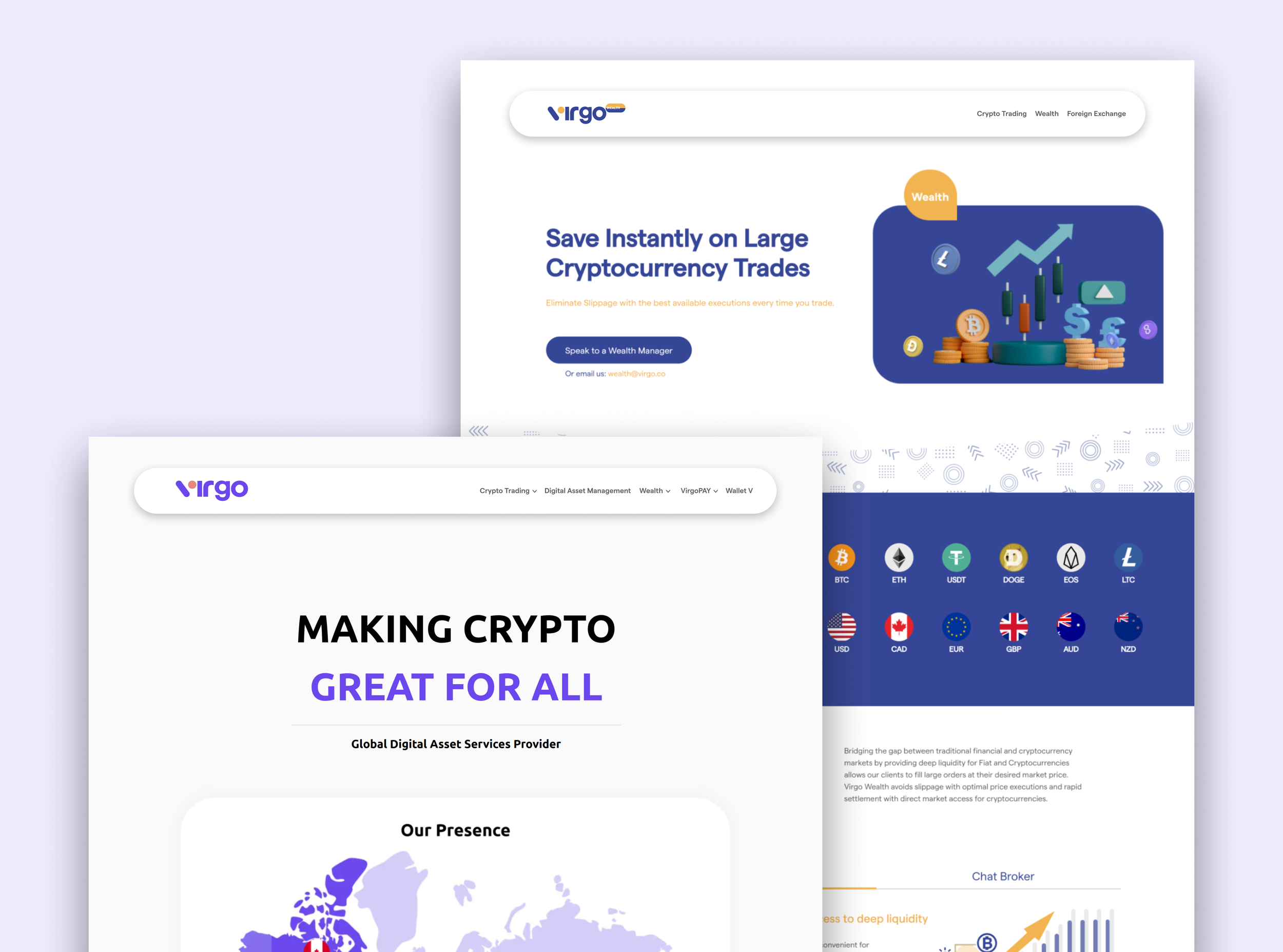
Logo
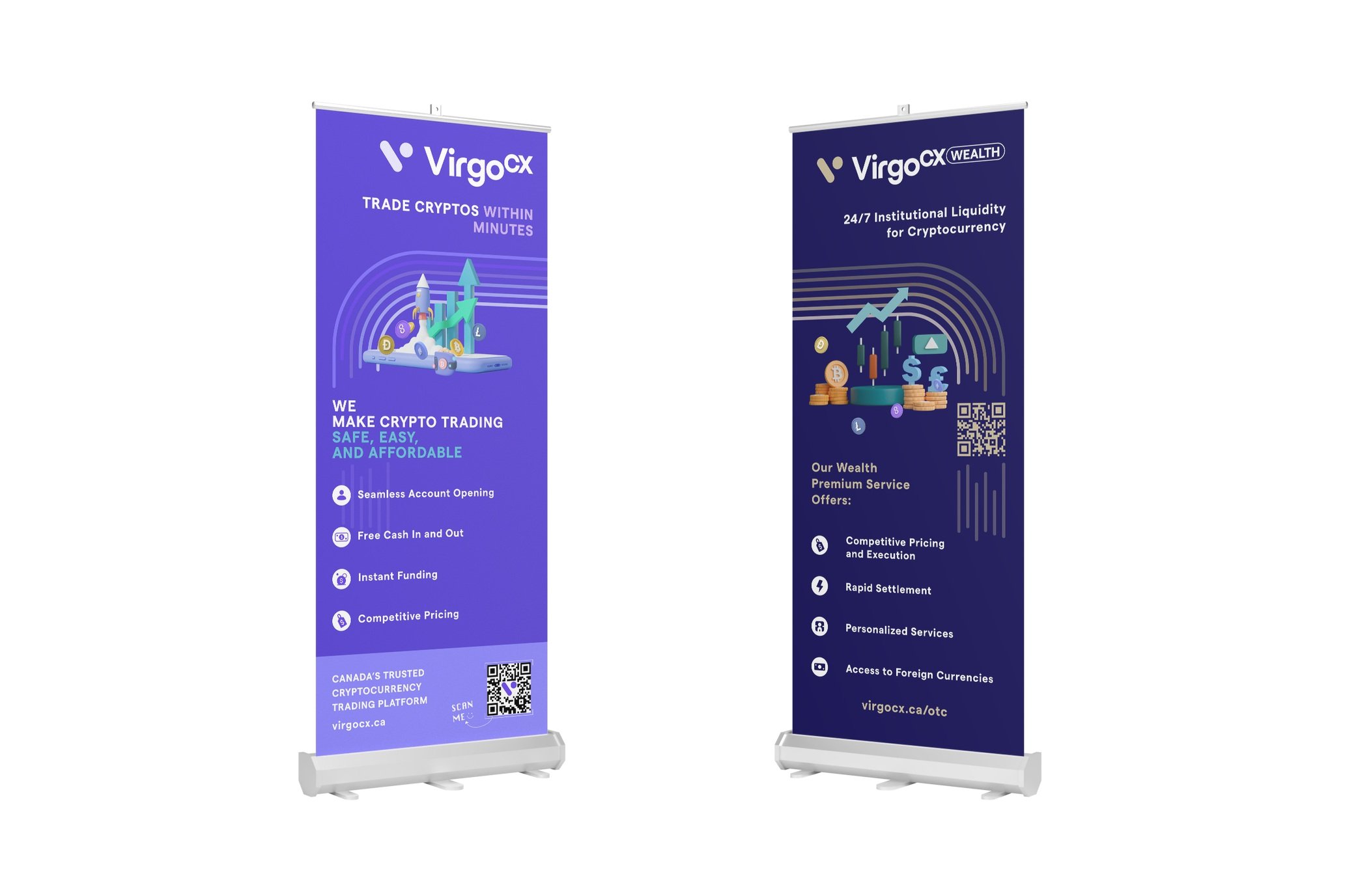
The original logos, “VirgoCX” and “VirgoCX Wealth,” along with their variations, were documented in the design system.
As the company expanded into Australia and the UK under the parenting company Virgo Group, so new logos for Virgo and Virgo Wealth were collaboratively developed with stakeholders, including color selections for both light and dark backgrounds. All logos were then systematically documented in the design system.
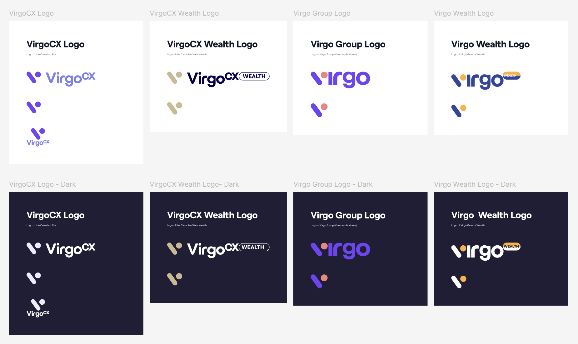
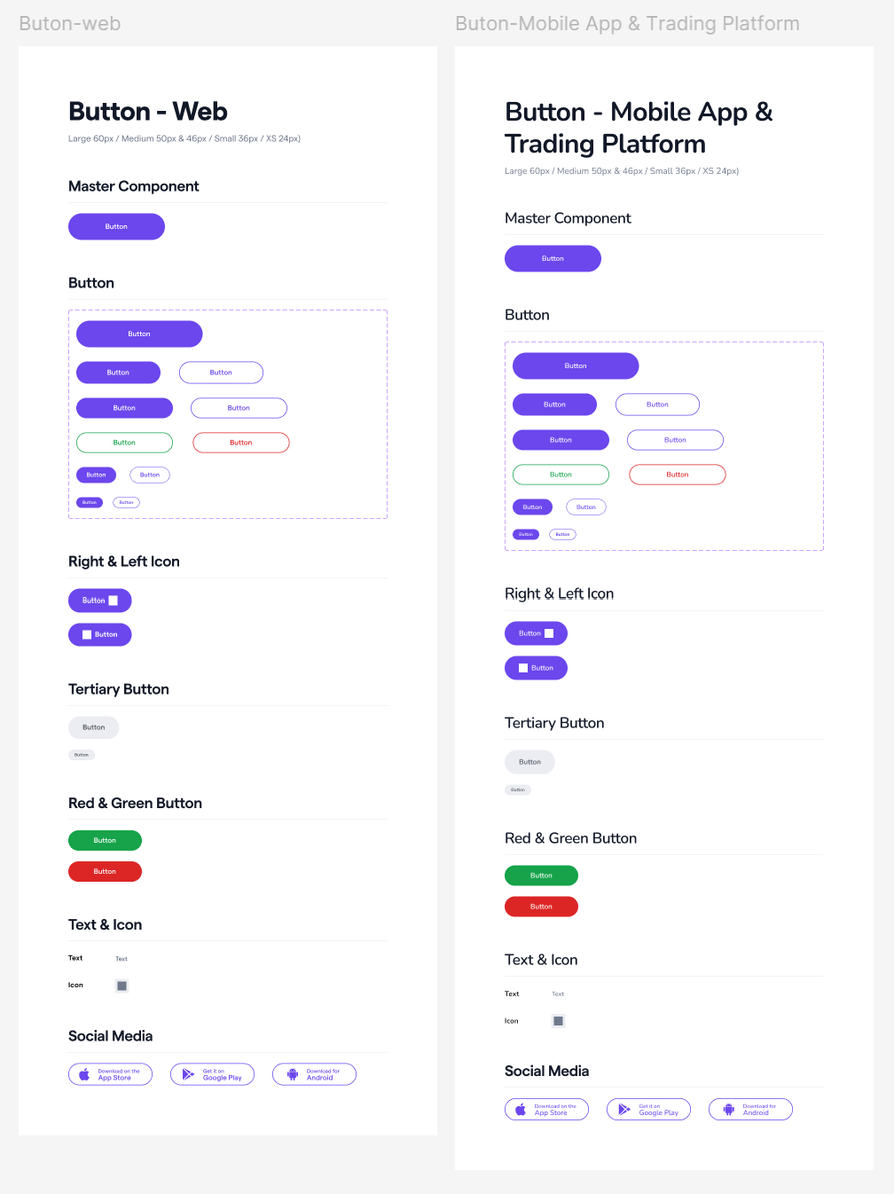
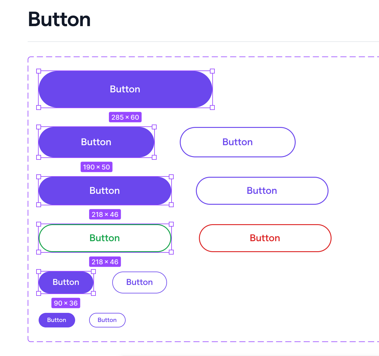
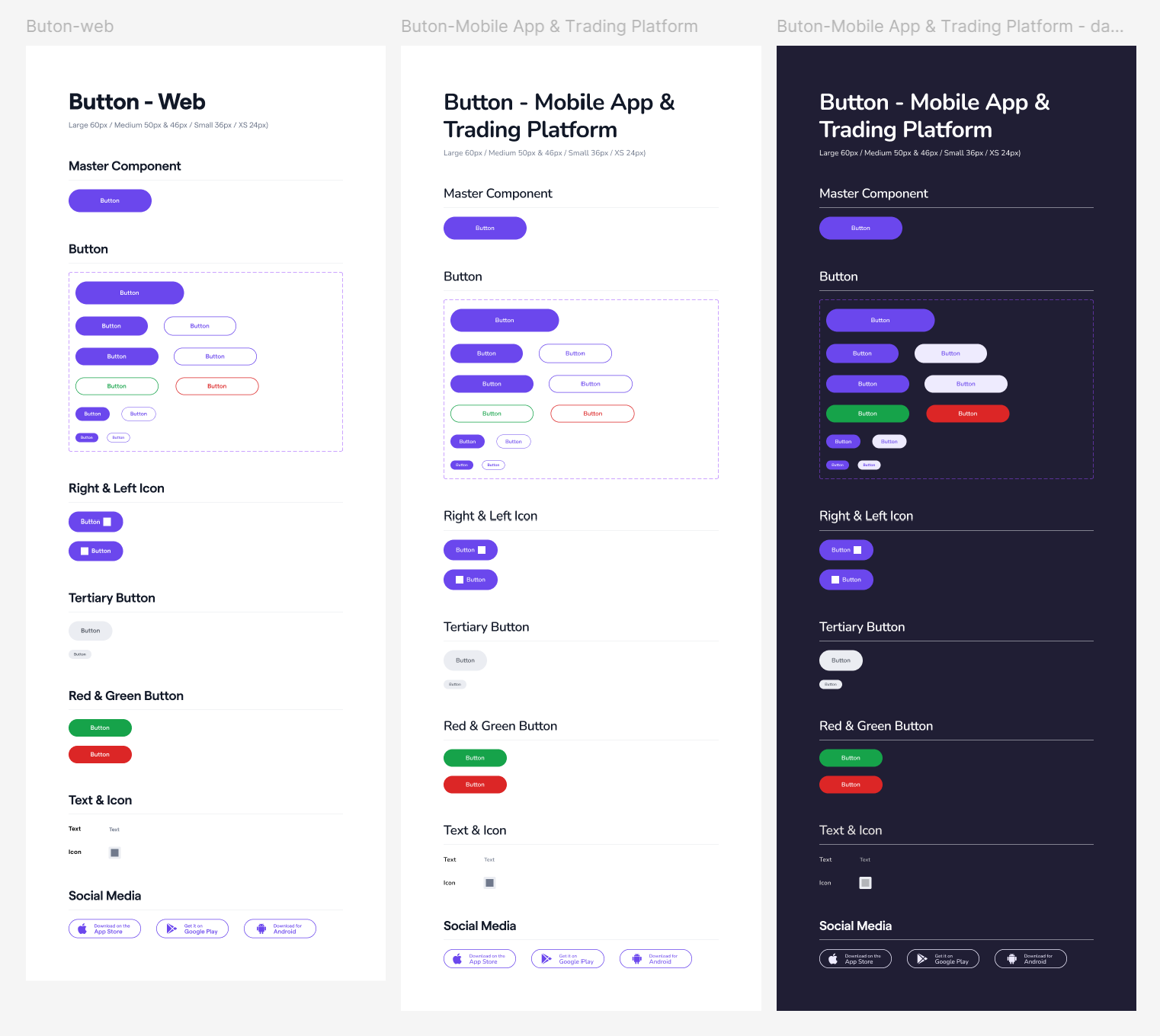
Button
When buttons came in all different shapes and sizes, the page could feel messy, and users might not immediately understand what each button does. We standardized buttons and their sizes — for example, large at 60px, medium at 50px, and small at 36px — and set the corresponding width rules for each size.
We also removed gradient colors from the buttons and kept them solid to ensure visual consistency.
Icons
At the beginning of building the design system, icons for both web and mobile were not standardized, as most were sourced from the Noun Project. This led to inconsistencies in style and line weight. To address this, a complete set of standardized icons was purchased to ensure consistency across current products and to support future business expansion.
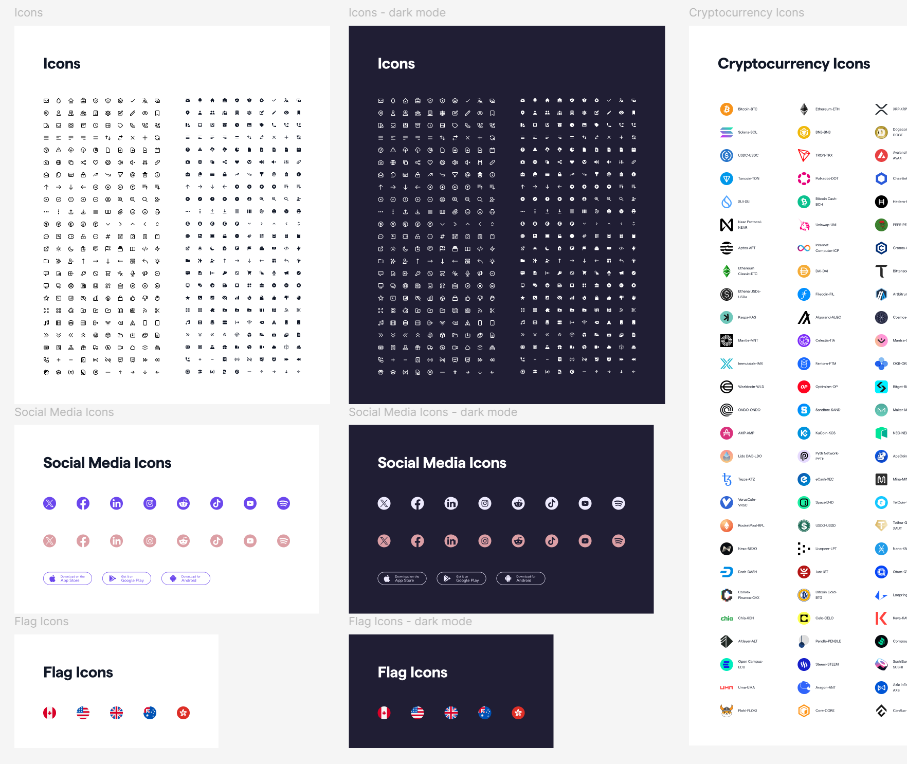
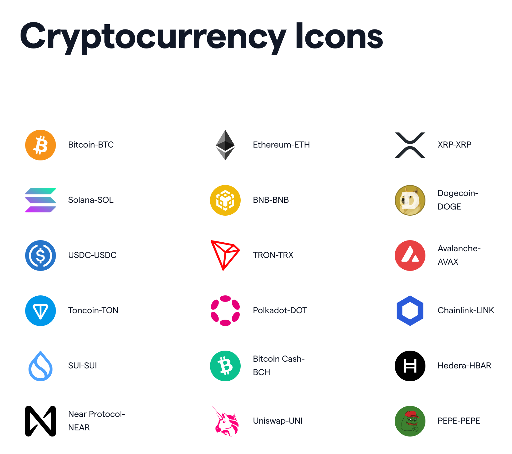
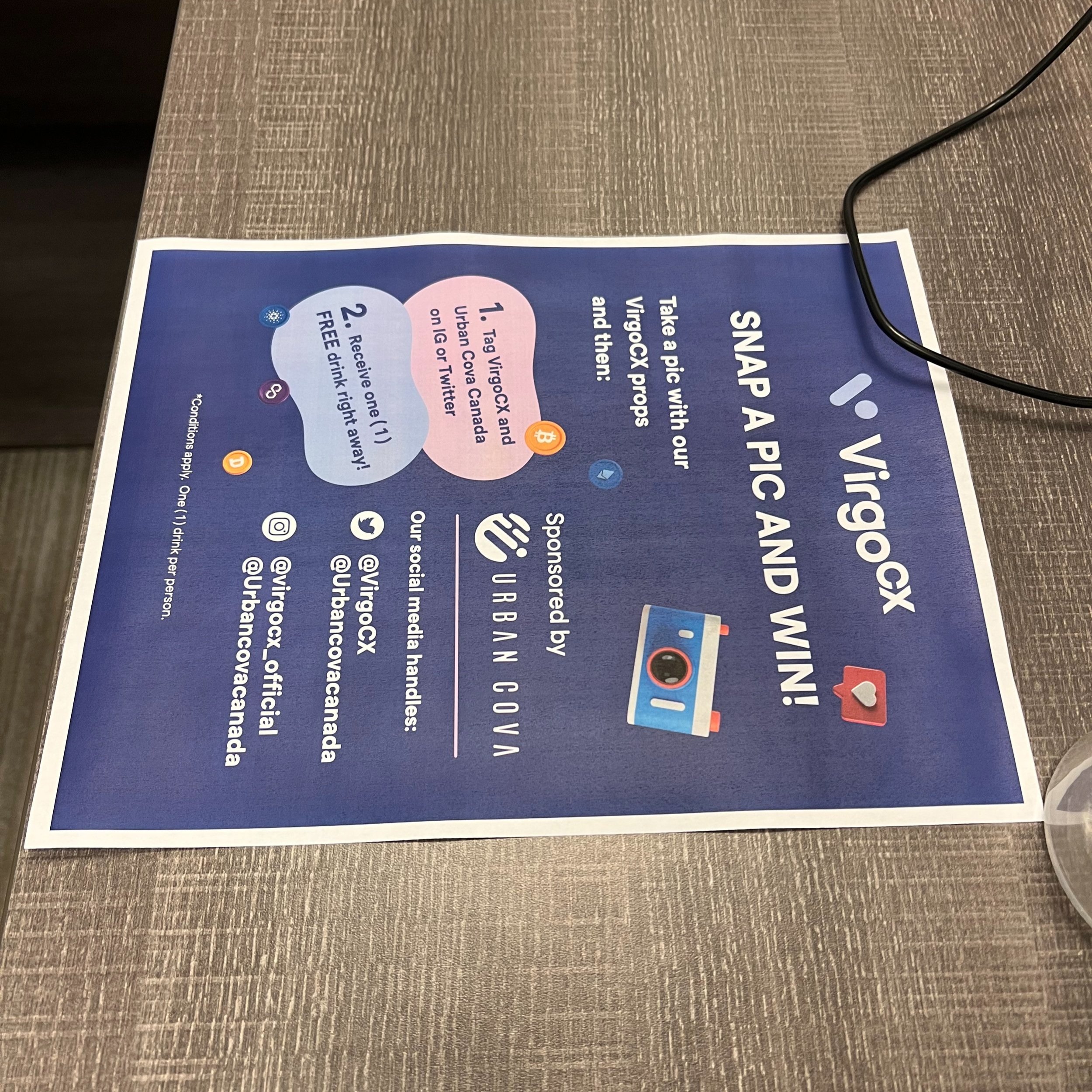
Cryptocurrency icons were heavily used across both product and visual design—ranging from the trading platform to marketing campaigns and printed event materials. To ensure consistency, I standardized these icons and properly labeled them in the design system, making them easily accessible for different teams and ensuring they were used consistently across all channels.
As new coins are added to the platform, their icons will continue to be added to the library to keep the system up to date.
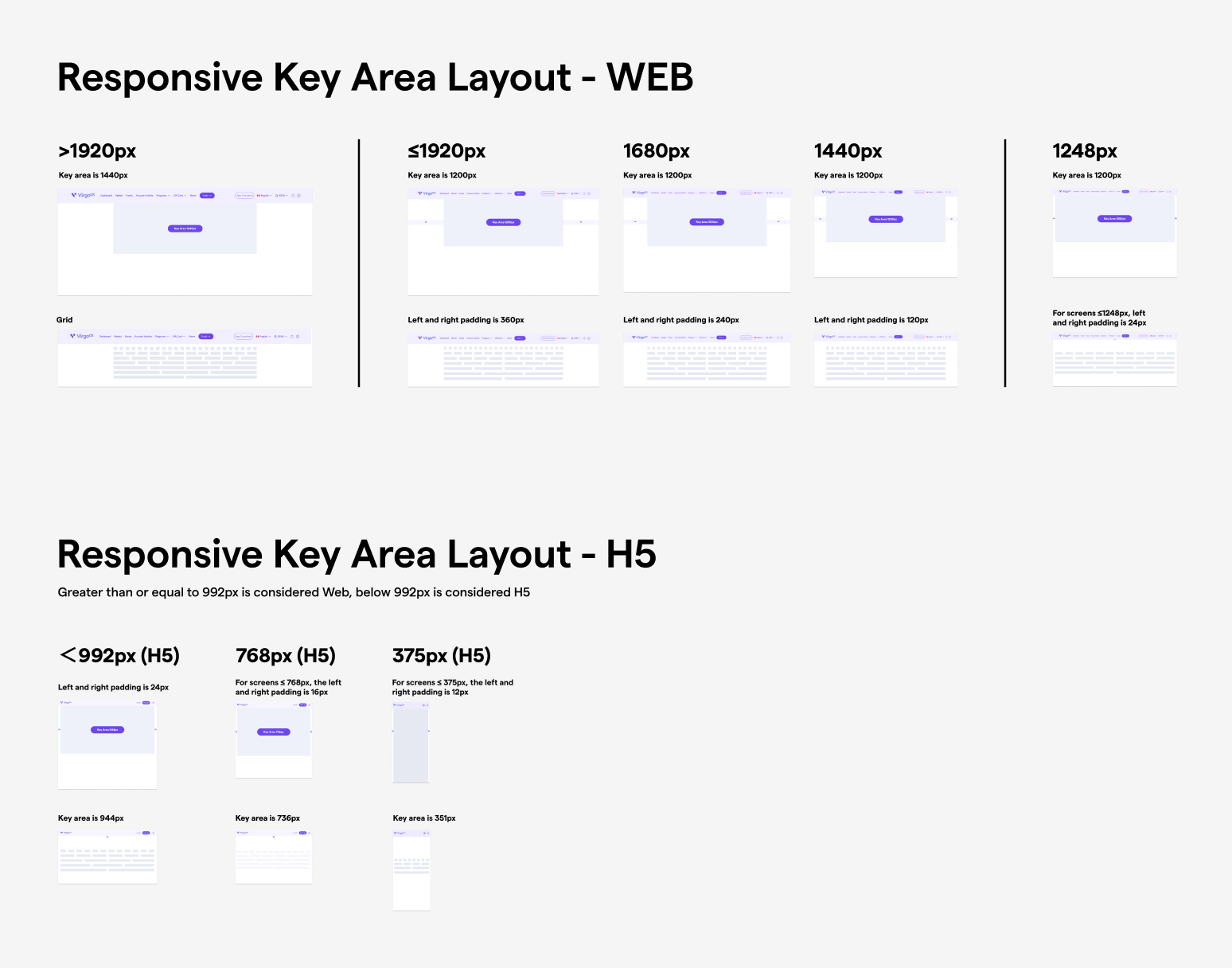
Responsive Key Area Layout for Web & H5
If the responsive key area layout isn’t standardized, maintaining consistency becomes difficult—especially when multiple standalone websites exist under the company. To solve this, we defined responsive key area layouts for both Web and H5 platforms to ensure consistent spacing and alignment across different screen sizes.
For Web (≥1248px), the key area ranges from 1200px to 1440px with horizontal padding between 24px and 360px. For H5 (<992px), we adopted a mobile-first approach, scaling the key area from 944px down to 351px with padding from 24px to 12px. These guidelines create a visually balanced, user-friendly layout and give developers clear rules for implementing responsive designs across all platforms.
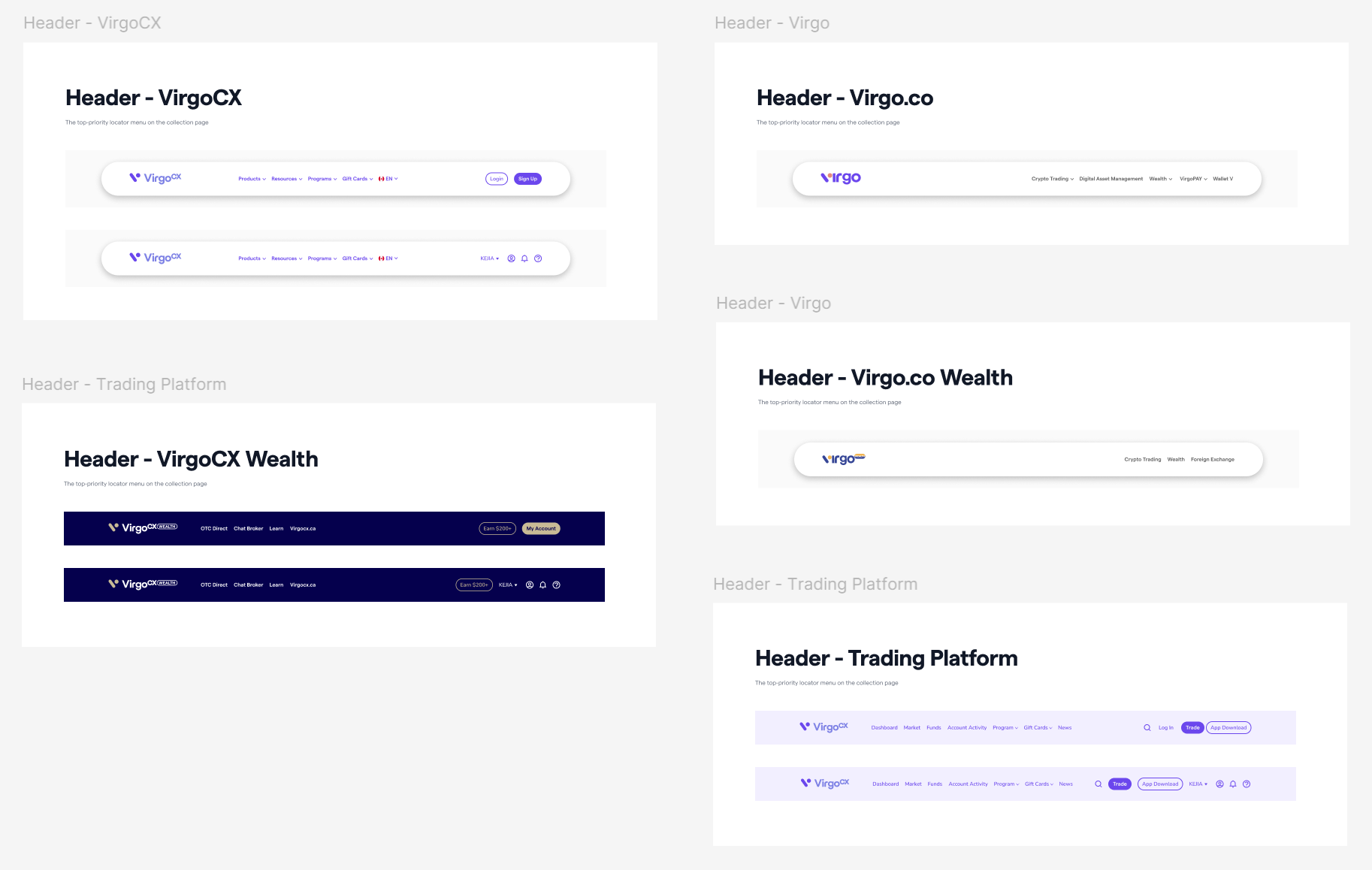
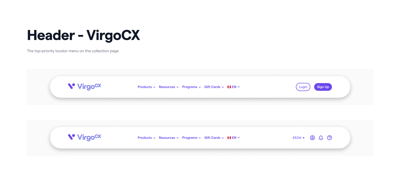
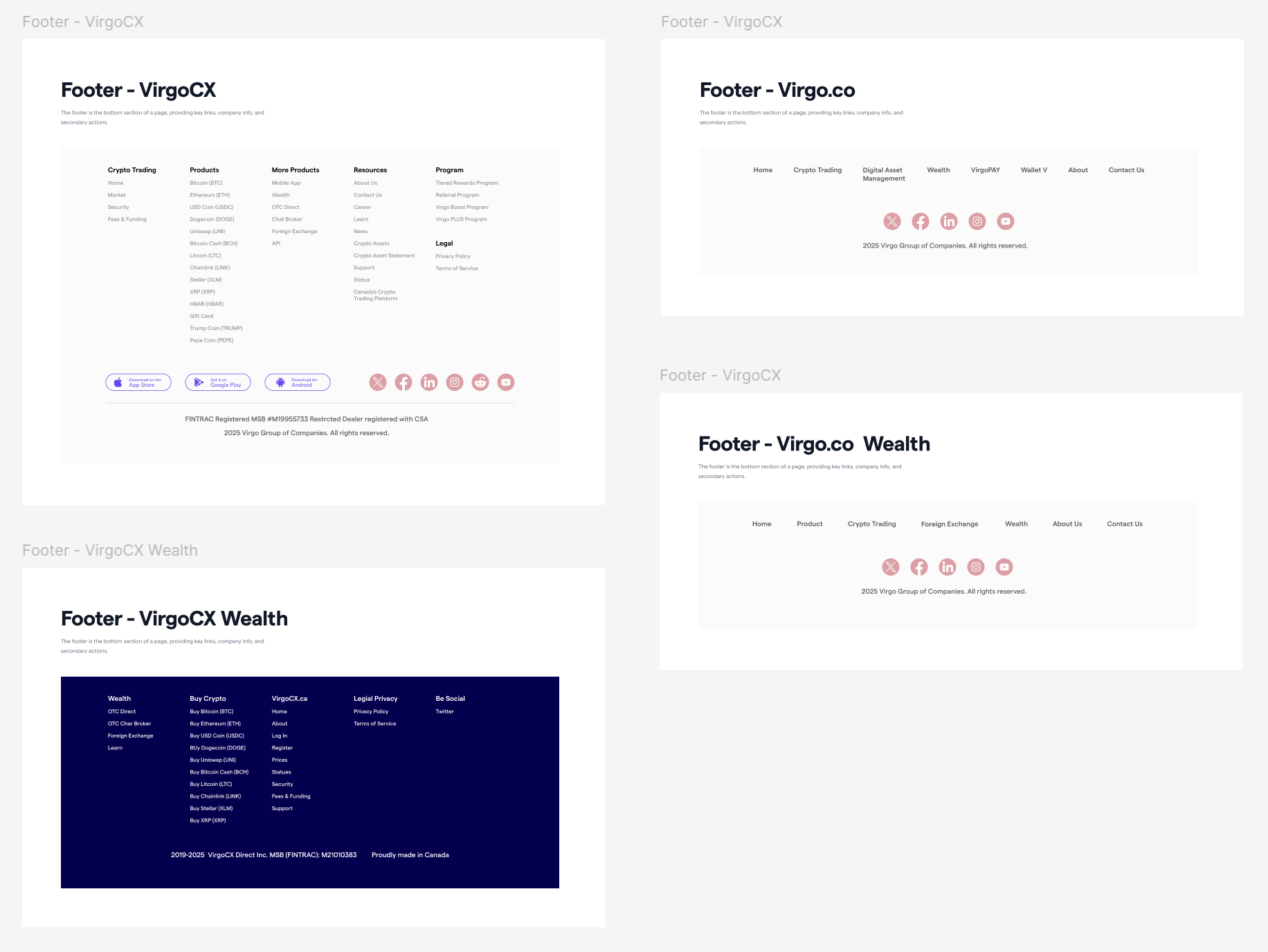
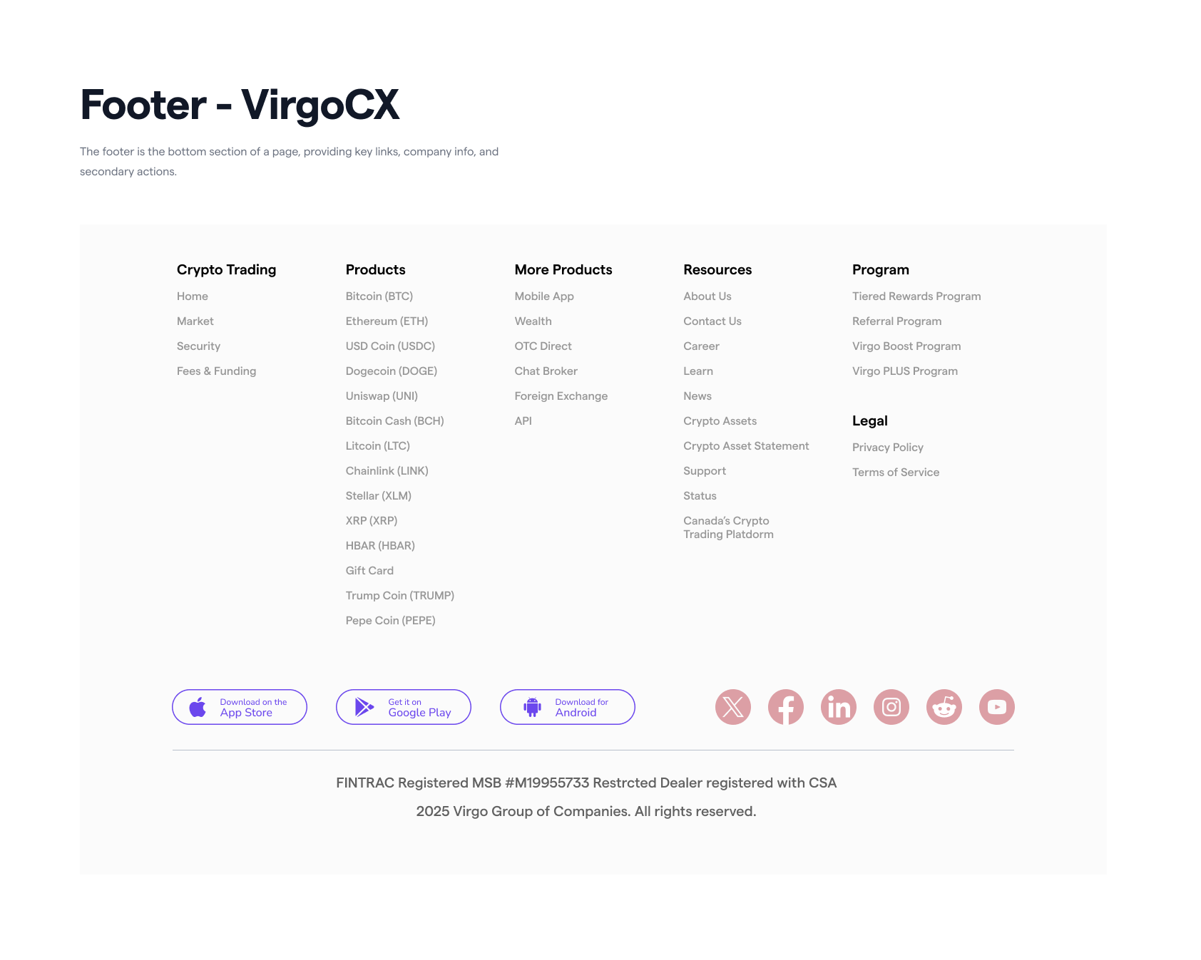
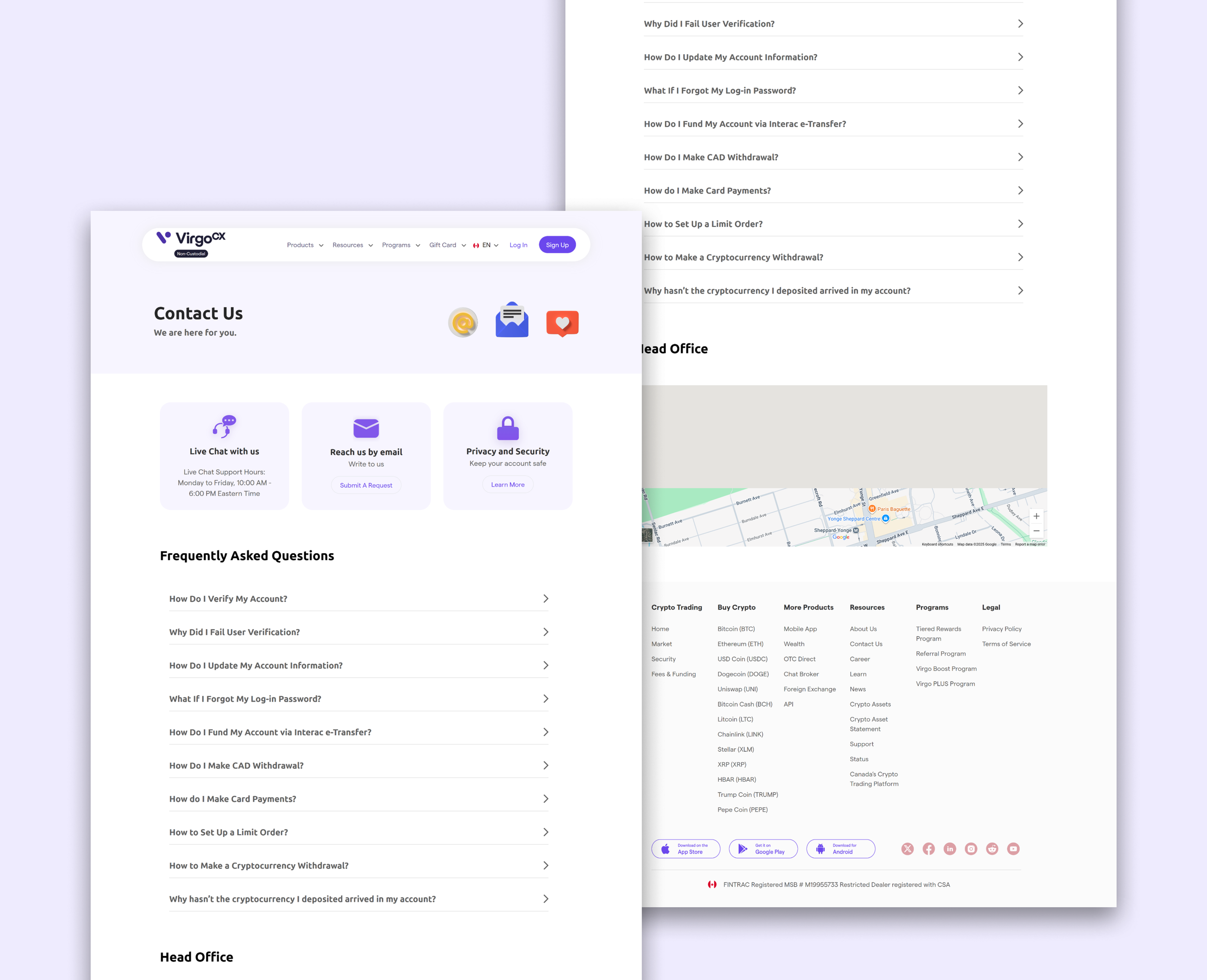
Header & Footer
With the revamp of the main website virgocx.ca, the header and footer were standardized to ensure consistency ahead of the company’s international expansion (worldwide site – virgo.co). The design and organization of the header and footer were collaboratively developed with the product manager and head of the product team.
In the design system, the header was structured into clear sections for navigation, search, and user actions, while the footer grouped links, company information, and secondary actions. This modular approach allows each element to be reused across products, maintaining a cohesive experience as the brand scales globally.
Others
The design system also includes a set of foundational and UI components—such as spacing scales, border radius tokens, checkboxes, dividers, switches, dropdown menus, input fields, and card layouts.
This design system is not a finished project but rather a foundation that continues to evolve. It is built to grow with the company’s products, allowing more components and standardized elements to be documented and added over time, ensuring visual consistency, development efficiency, and scalability across platforms.
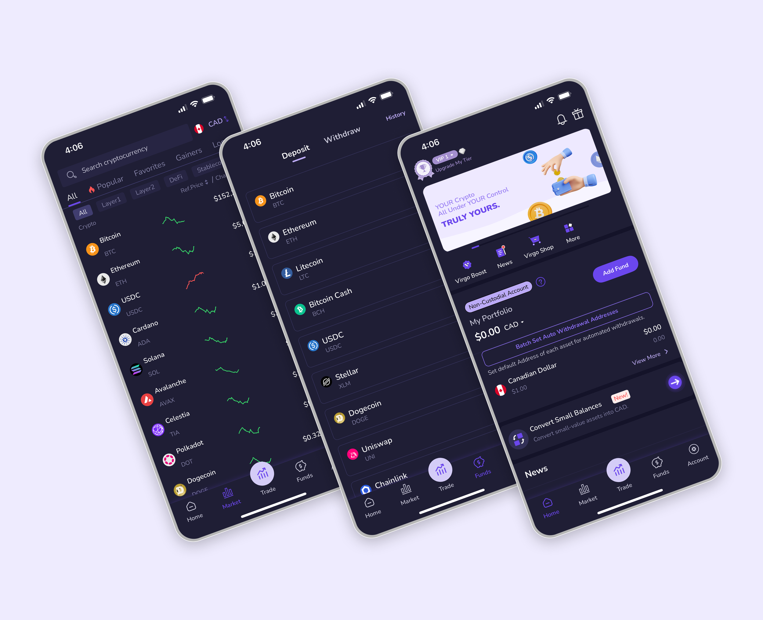
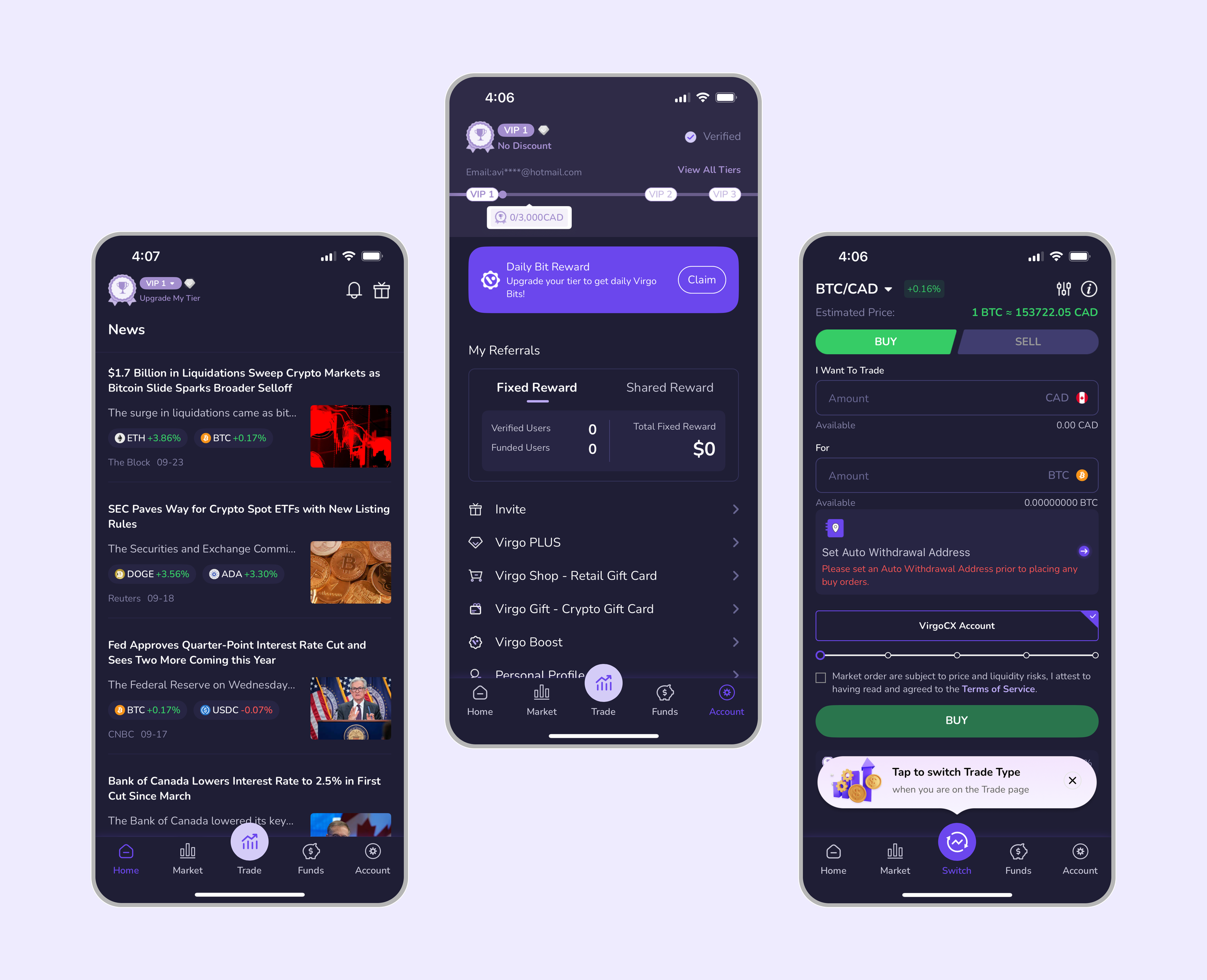
DESIGN SYSTEM IN ACTION
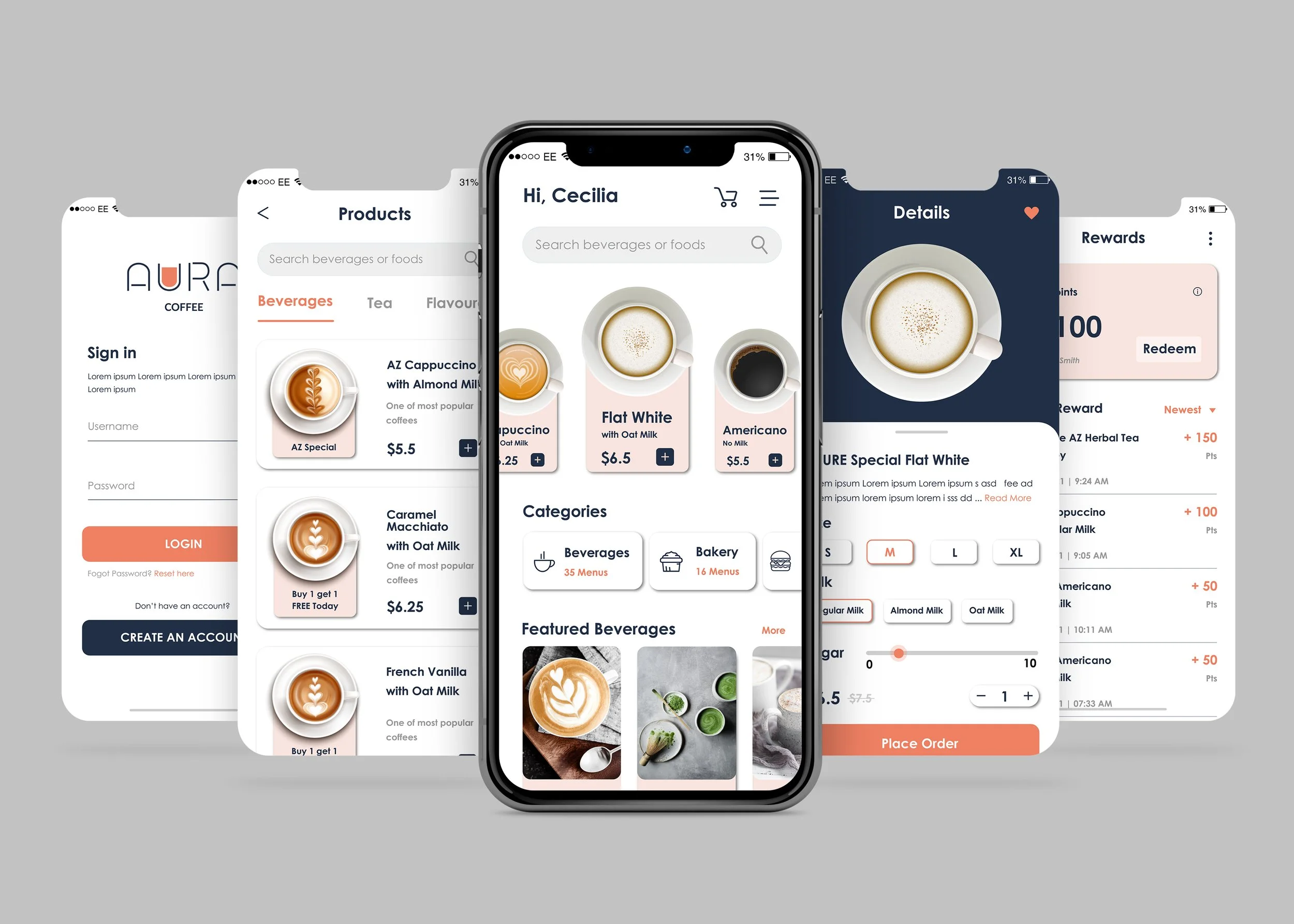
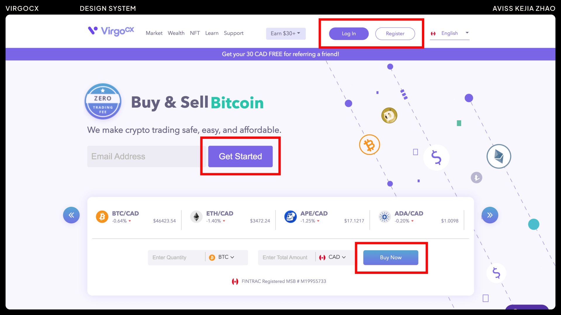
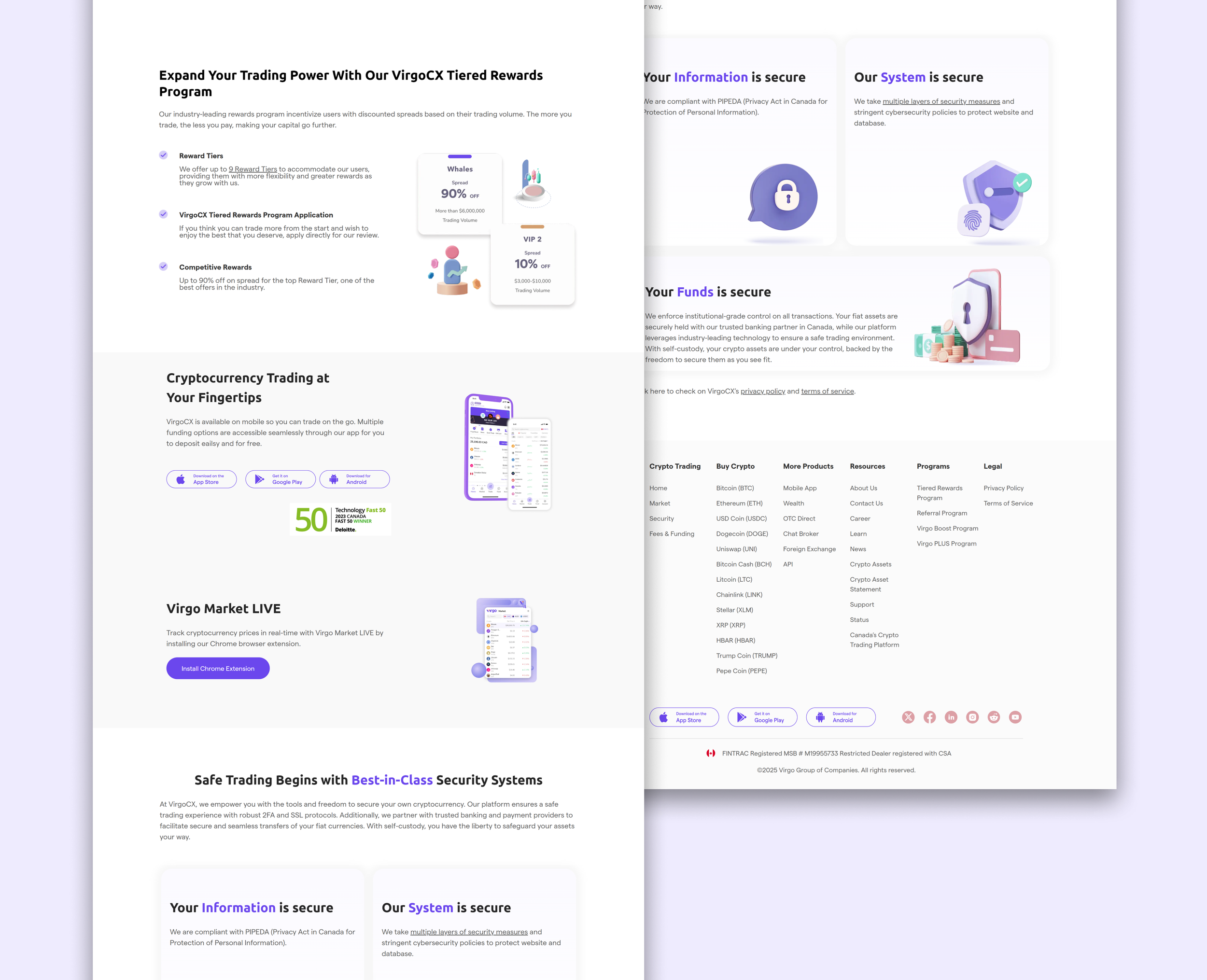
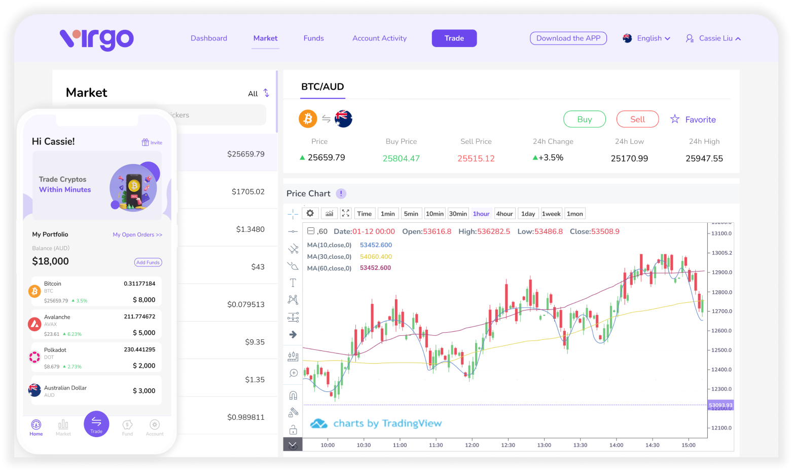
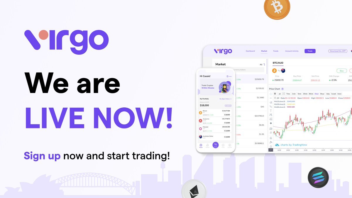
Canadian Website Redesign
Using the design system during the website revamp ensured that each component was standardized and consistently implemented across the redesign. This not only created a more cohesive look and feel but also streamlined the process of updating and building new subpages. With predefined styles, spacing, and interaction patterns in place, the design system served as a reliable foundation—reducing inconsistencies, accelerating the redesign process, and making future iterations more efficient and scalable.
Old website:
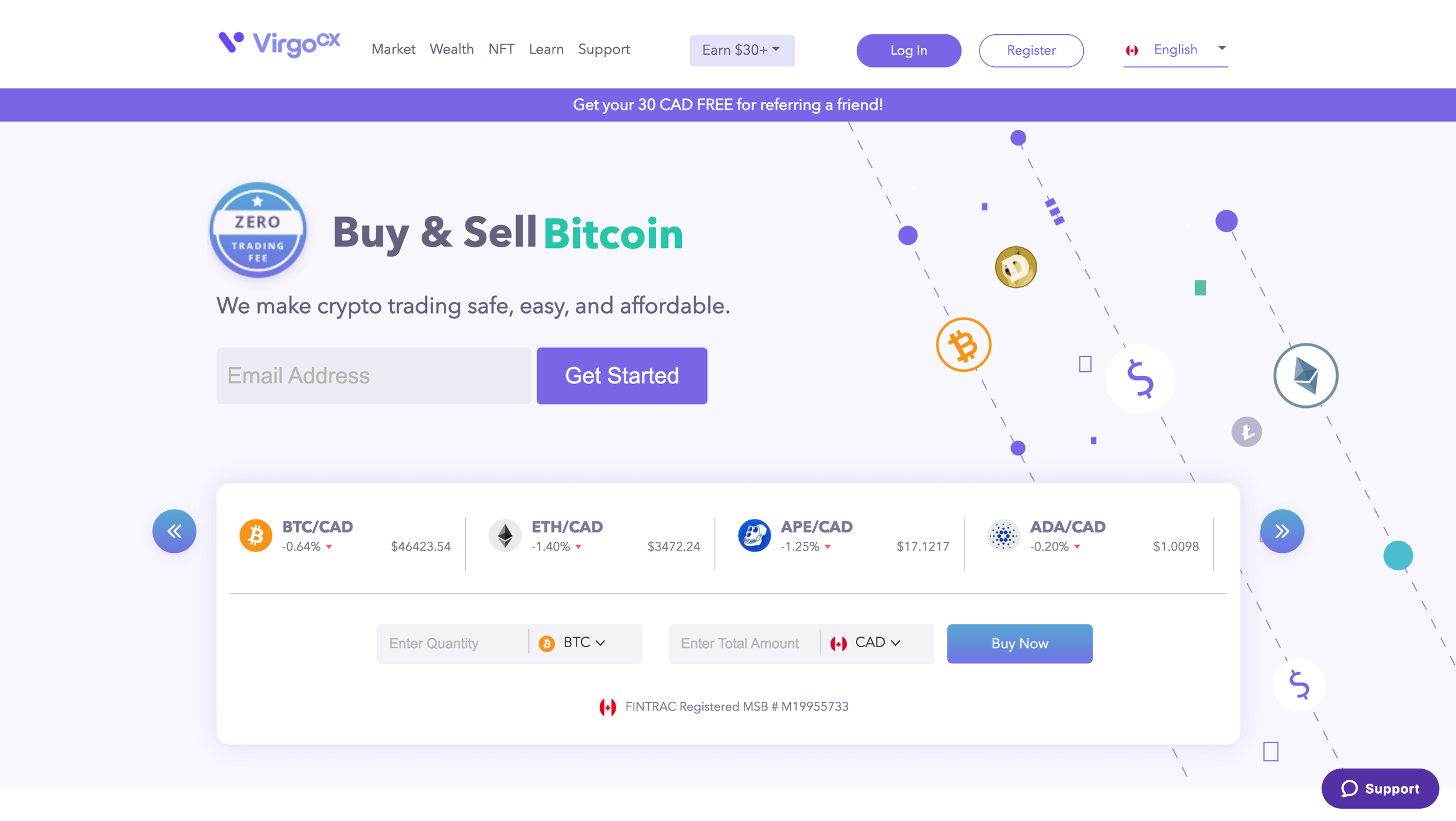
Website revamp:
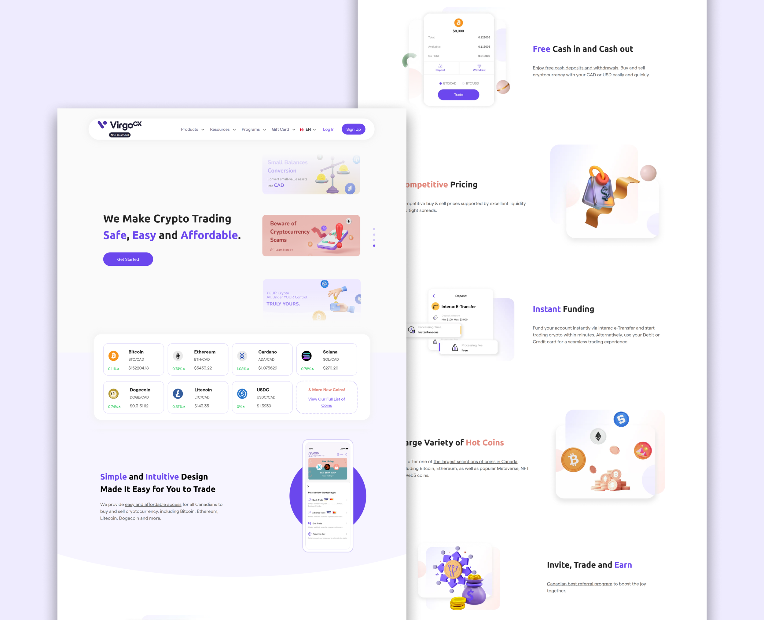
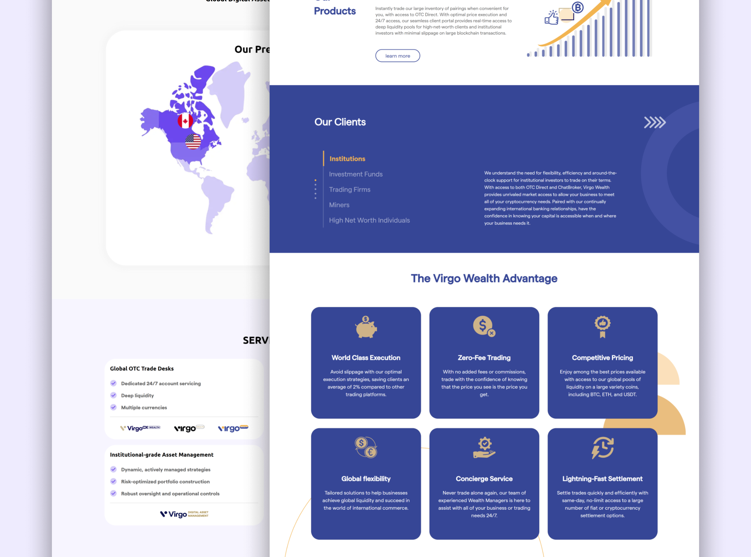
Brand / Global Consideration
With VirgoCX expanding overseas, the updated design system became the foundation for building the new Virgo.co website, supporting the company’s global business strategy. By leveraging standardized components, typography, and color systems, we ensured consistency across regions while still allowing flexibility for localization. This made it easier to adapt layouts, adjust content hierarchy, and refine visual tone to suit different markets and cultural contexts. For example, we considered color symbolism, readability across languages, and variations in communication style to make the brand feel familiar yet locally relevant. The design system not only maintained brand consistency across multiple platforms but also provided the scalability needed to support future international growth.
Dark Mode
At that stage, instead of implementing broader accessibility features at once, the team and I decided to focus on dark mode first. Users check the markets throughout the day and night, so readability was key. We tried out several color palettes and finally landed on a dark mode for the mobile trading app first. With the design system in place, adding dark mode to the website in the future will be much easier.
Design Consistency Across Teams and Channels
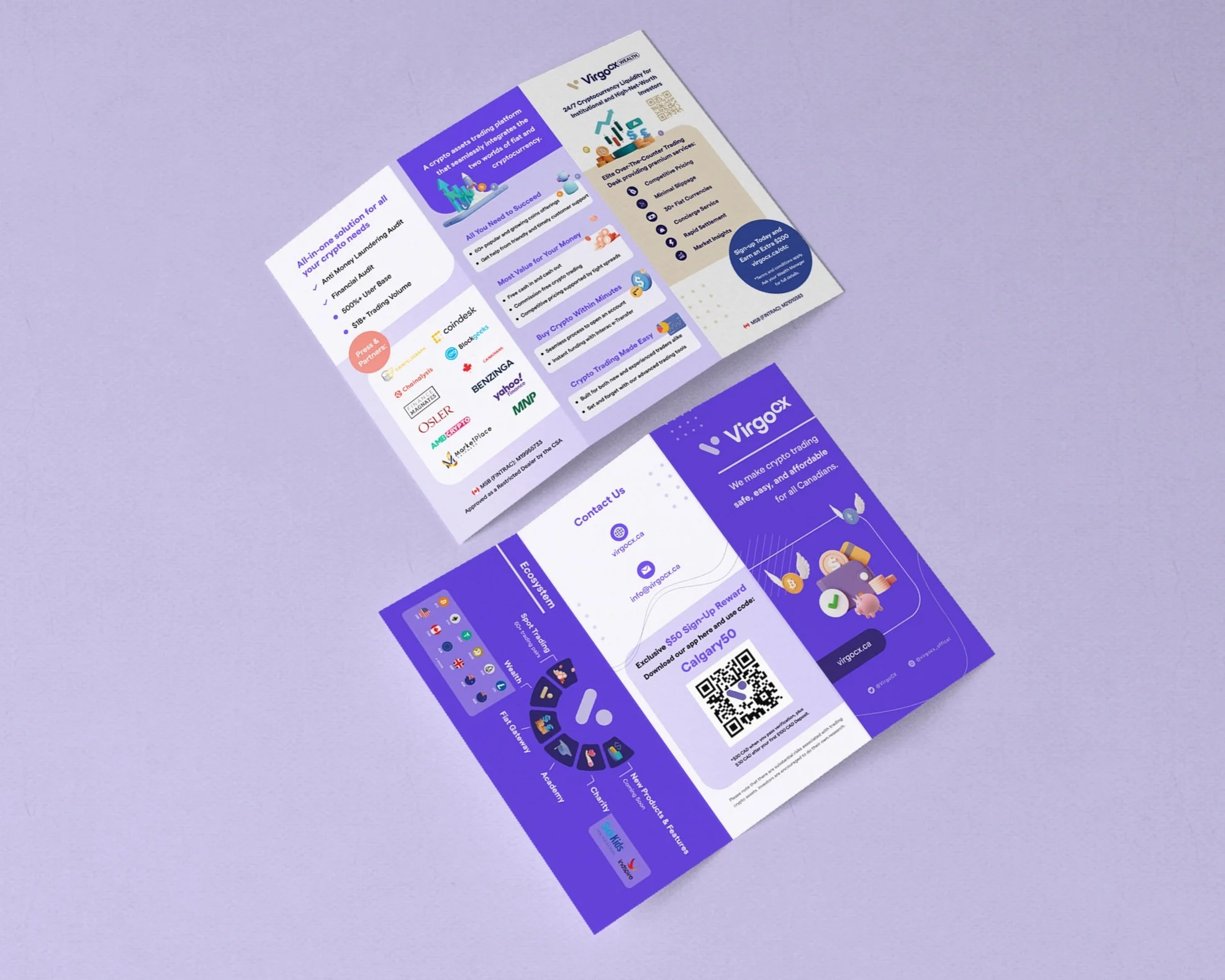
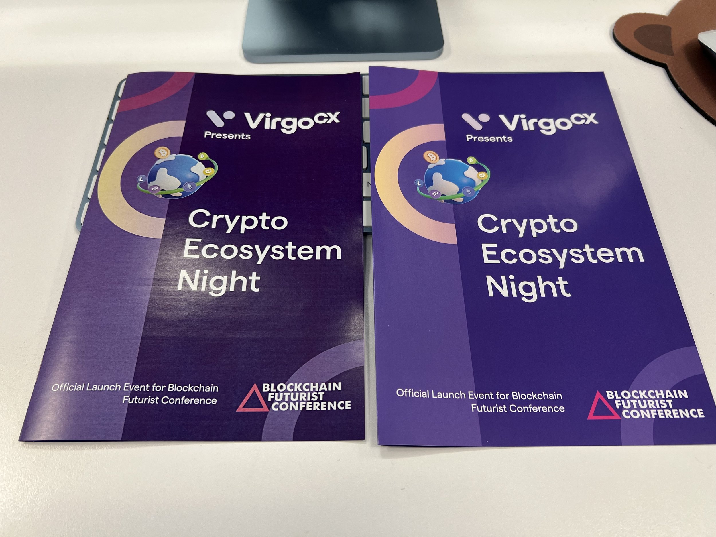
Since the design system was established, core brand elements such as logos, colors, typography, and icons have been standardized and centralized. This allows not only the product team, but also the wealth and marketing teams to easily access and reuse these assets when creating presentation decks, marketing campaign, social media visuals, documents, or printed event materials.
By extending beyond product UI, the design system became a shared visual foundation for the entire organization. It helps different teams work faster, while ensuring brand consistency across digital products, marketing channels, and physical printed materials. As a result, the overall design direction stays aligned and recognizable across platforms, teams, and media.

CHALLENGES
Behind the scenes, we had to navigate several challenges.
Timeline: This was a long-term, ongoing project that I worked on alongside my core responsibilities. Because of that, progress was incremental, and each phase took longer than initially expected. We focused on steady, sustainable progress rather than rushing incomplete solutions.
Technical constraints: While we prioritized foundations and core components first—most of which could be built and gradually implemented—there were still areas that required compromise. For example, ideally we wanted to use gradient buttons and possible animations, but developers pointed out that solid colors were more feasible at the time without heavy CSS overrides. In this case, We decided to use solid colors for now while keeping the long-term vision in mind.
Trade-off decisions: As the system continues to grow and we move deeper into details like component states, interaction behaviors, do/don’t examples etc., technical limitations naturally surface more often. These situations require ongoing collaboration and mutual agreement to balance design quality, feasibility, and scalability.
COLLABORATION
In this project, collaboration was a key part of building a practical and scalable design system. I worked closely with the design lead to align on strategy, audit the existing interface patterns, and define core principles that would guide our work.
Throughout the process, I partnered with developers to understand technical constraints early, ensure our design decisions were implementable, and maintain a shared language around components and interaction behaviors.
By keeping an open feedback loop, using shared tools like Figma, we were able to reduce ambiguity, speed up handoffs, and maintain consistency between design intent and code implementation. This close cross‑functional collaboration helped streamline workflows, minimize rework, and ultimately make the system more useful and adoptable for both design and engineering teams.
NEXT STEPS
The next steps for the design system include:
Comprehensive documentation: Creating detailed documentation for all components and guidelines will make the system easier for the entire team to use and ensure consistency as it grows.
Expanding components: We plan to add more detailed components and may eventually separate the system into web and mobile versions to better support platform-specific needs.
Enhanced accessibility: Key initiatives include supporting users with color vision deficiencies and implementing a “senior mode.” Stakeholders and the Head of Product have recognized the importance of these features and support their future implementation.
WCAG alignment: We will ensure components and interactions follow WCAG guidelines, including maintaining sufficient color contrast, providing descriptive labels for screen readers, and supporting scalable text. These measures will make the platform more inclusive and user-friendly for a diverse range of users.
Web Content Accessibility Guidelines
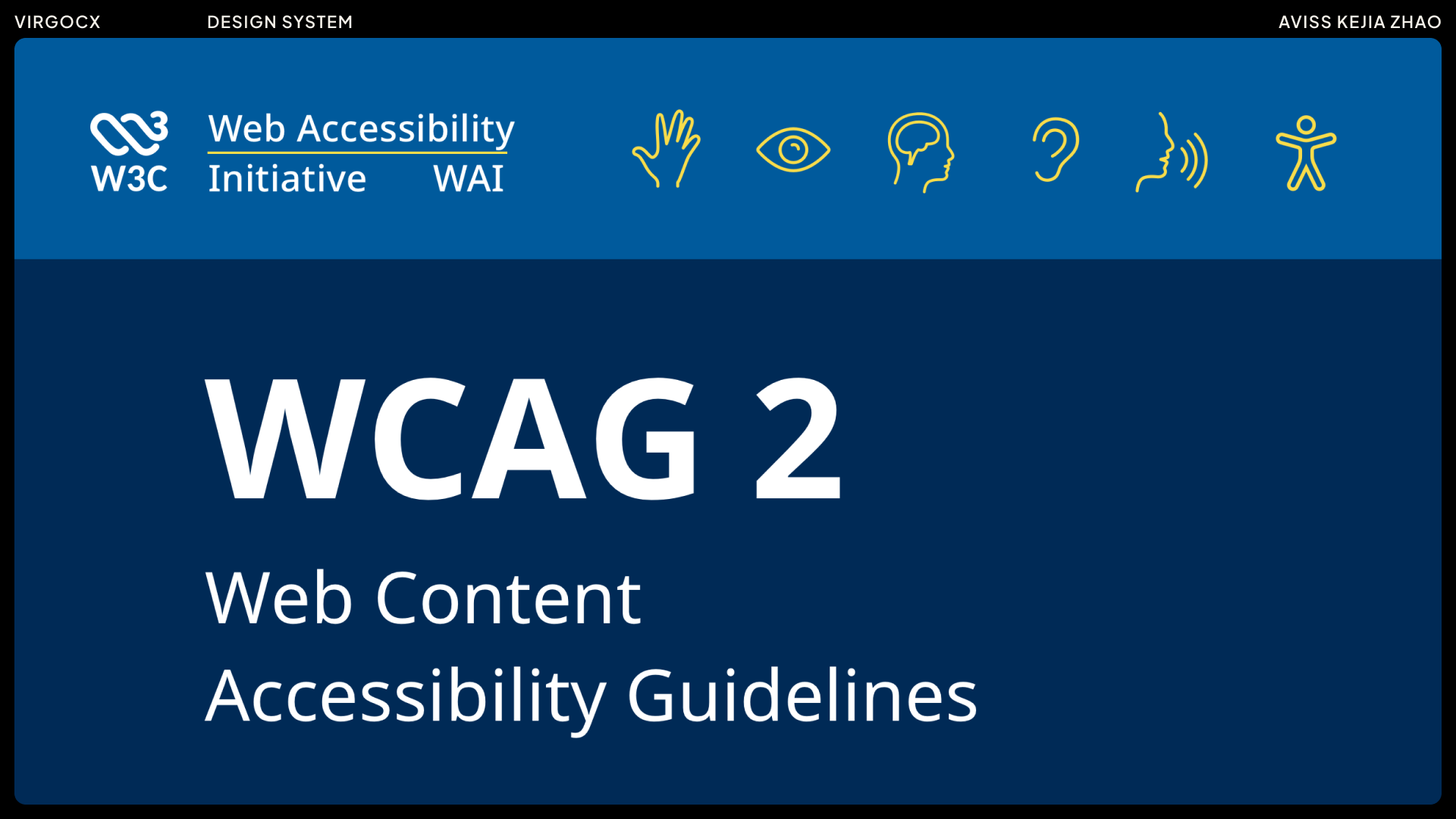
WCAG 2.2 was officially published as a W3C Recommendation on October 5, 2023. It builds on earlier versions like WCAG 2.1 by introducing new success criteria that address gaps in accessibility, including better keyboard interaction, clearer focus visibility, and improved mobile usability. As digital products and user behaviors continue to evolve, these updated standards are especially important today. More governments and organizations are adopting WCAG as a legal requirement and best-practice benchmark, and aligning with WCAG 2.2 helps ensure products are inclusive, usable for a wider range of users, and compliant with accessibility regulations across different regions.
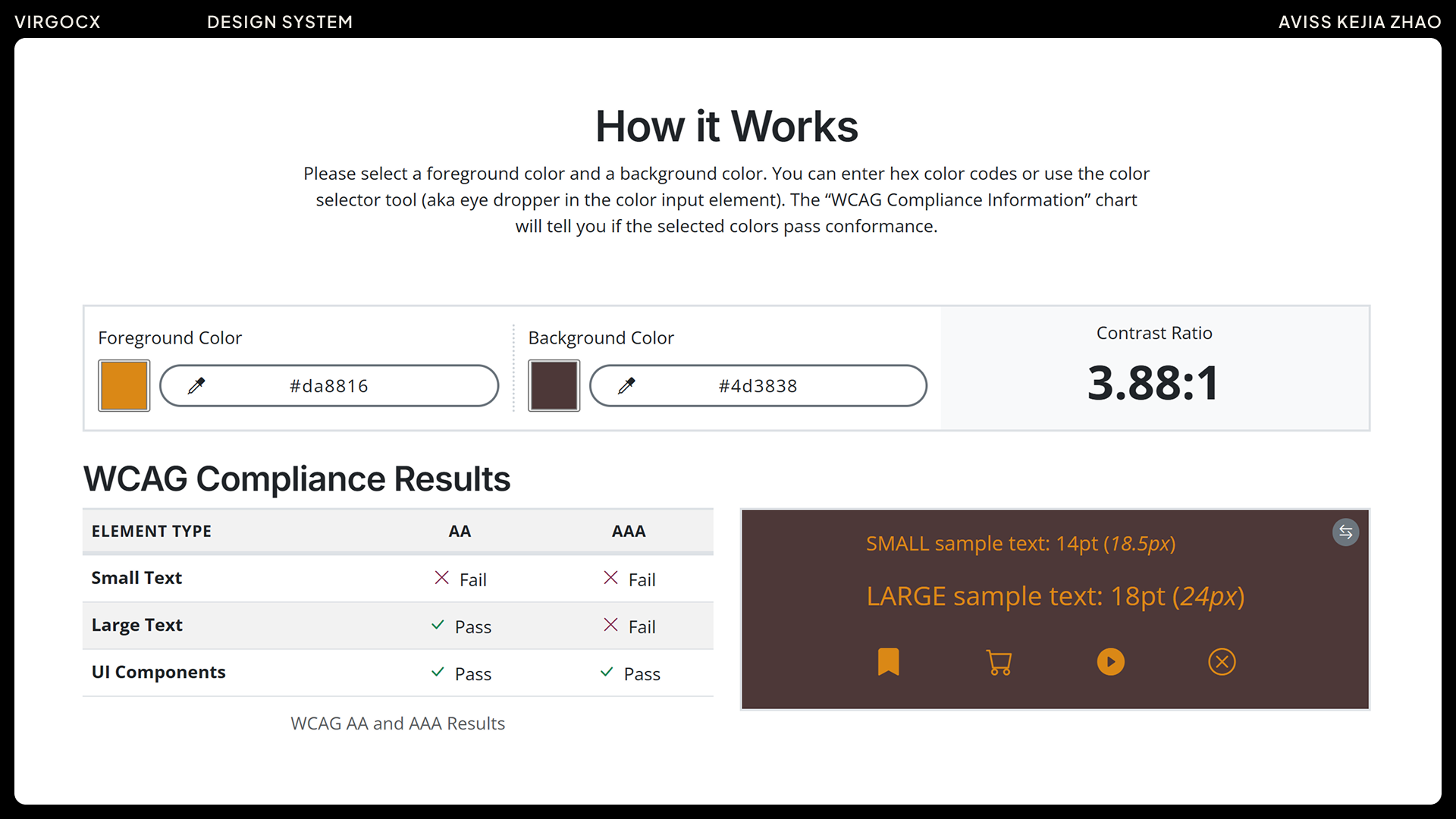
The next step is to become familiar with WCAG 2.2 guidelines and use them as a reference when building and updating the design system. For example, we can check color contrast ratios to ensure text is readable, provide descriptive labels for screen readers, maintain proper focus indicators for keyboard navigation, and support scalable text for users who need larger fonts.
Following these standards is not only about compliance—it’s also a great opportunity to learn, grow, and stay up-to-date with modern accessibility practices, ensuring our designs remain inclusive and user-friendly.
OUTCOMES
By standardizing core components, the design system streamlined collaboration between designers and developers, reducing duplicated work and minimizing back-and-forth. This led to an estimated 20–30% faster design-to-development handoff and helped new team members onboard more quickly by providing clear, reusable patterns.
It’s an evolving, ongoing effort rather than a finished product.
I built the design system from the ground up as a living, scalable framework to support the company’s expanding products. While it currently defines core components, responsive layouts, typography, and visual guidelines, it remains an evolving project, with new elements continuously added.
Working on the design system was a valuable experience that went beyond creating UI components. It gave me a deeper understanding of how design decisions impact scalability, consistency, and cross-team collaboration. I realized that a design system is never truly complete, but rather an evolving foundation that grows with the product and organization. Through this process, I also learned the importance of balancing design clarity with flexibility, ensuring that components are not only standardized but also adaptable to future needs. This experience strengthened my ability to think systematically, collaborate closely with product managers and developers, and approach design with a long-term perspective.