Gate.io Homepage Redesign

BRIEF
In April 2024, I participated in a contract project with Gate.io, one of Asia’s leading cryptocurrency trading platforms, to revamp its entire UI and upgrade its information architecture from version 2.0 to 3.0.
Here is a bit of info about Gate.io:
Gate.io is a centralized cryptocurrency exchange, established in 2013, that provides a platform for buying, selling, and trading over 3,800 cryptocurrencies. It's known for its wide range of supported cryptocurrencies, diverse trading options (including spot, margin, and futures), and advanced trading tools like trading bots and copy trading.
I was tasked with redesigning the Gate.io homepage by first identifying existing issues and then proposing solutions. Below is a demonstration of my analysis and approach before moving into the revamp process.
PROJECT INCLUDED
UX Design | UI Design | Product Design | Issue Analysis | Hi-Fi UI Solution
TASK REQUIREMENTS
Analyze existing problems on the homepage, identify key issues, and break them down
Undertake a homepage redesign, with the scope covering—but not limited to—the homepage. Testers can adjust the scope according to their specific needs.
Explain your understanding of the product, your design strategy, and your approach to problem-solving.
Deliver a complete and finalized UI design solution.
This is what Gate.io’s 2.0 homepage looks like in English & Chinese version:


COMPETITVE ANALYSIS
Since Gate.io is a cryptocurrency exchange, conducting competitor analysis and research before redesigning the homepage was essential. It was important to select appropriate competitors to analyze their strengths and weaknesses—identifying which advantages could be adopted and which aspects were unsuitable for our product.
After reviewing numerous exchanges across Asia and North America, I focused on three major Asian platforms: OKX, Binance, and Bybit. My summary of their approaches is that all three have optimized and revamped their websites and apps by embracing simplicity—streamlining complex and redundant features to highlight only the most essential elements. They also use attractive visual effects to enhance the user experience subtly. This trend toward “less is more” might well represent the future direction of UI/UX design: simplifying complexity while maintaining elegance.
Here is a brief overview of how the OKX and Binance mobile apps look:
OKX
As one of the leading exchanges in Asia and worldwide, OKX is an innovative cryptocurrency exchange with advanced financial services. It provides hundreds of tokens and trading pairs. They are serving millions of users in over 100 countries. OKX is providing spot, margin, expiry, options, perpetual futures trading, DeFi, lending, and mining services.


Binance
Binance is one of the world’s largest and most popular cryptocurrency exchanges. It offers a comprehensive platform for trading a wide variety of digital assets, including spot trading, futures, options, staking, savings, and more. Binance is known for its high liquidity, extensive range of cryptocurrencies, advanced trading features, and global reach. It also provides services like a blockchain ecosystem, a launchpad for new tokens, and educational resources for users.


REDESIGN PROCESS
Goals
Conducted problem analysis of the Gate.io homepage, identifying and breaking down existing issues.
Redesigned the homepage while maintaining Gate.io’s existing style and brand color scheme.
The core objective of the redesign was to improve information presentation, information architecture, interactions, as well as the use of visual elements.
The homepage redesign was primarily based on the English version of the site.


Analysis of Issues
By identifying problems and pain points, I thoroughly analyze how each interactive element functions—examining where and how clickable components navigate users. I assess all UI elements, including icons, colors, images, and abbreviations, to ensure they communicate clear and accurate information. Throughout the process, my focus is on pinpointing areas of confusion or inconsistency and exploring how to enhance usability and clarity effectively on homepage.
Here are some issues I identified that could be addressed or improved during the actual UI revamp:


Redesign with Explanation
By addressing each issue, I provided solutions focused on enhancing user needs while ensuring consistency and accessibility. Rather than implementing dramatic changes, I focused on the finer details—such as overlooked functions, icons, and colors etc. I firmly believe that “great design lies in the details—refining every element ensures clarity, usability, and a meaningful connection with users.”


Redesign with Explanation in Chinese


Final Deliverable


PROJECT CONTRIBUTION
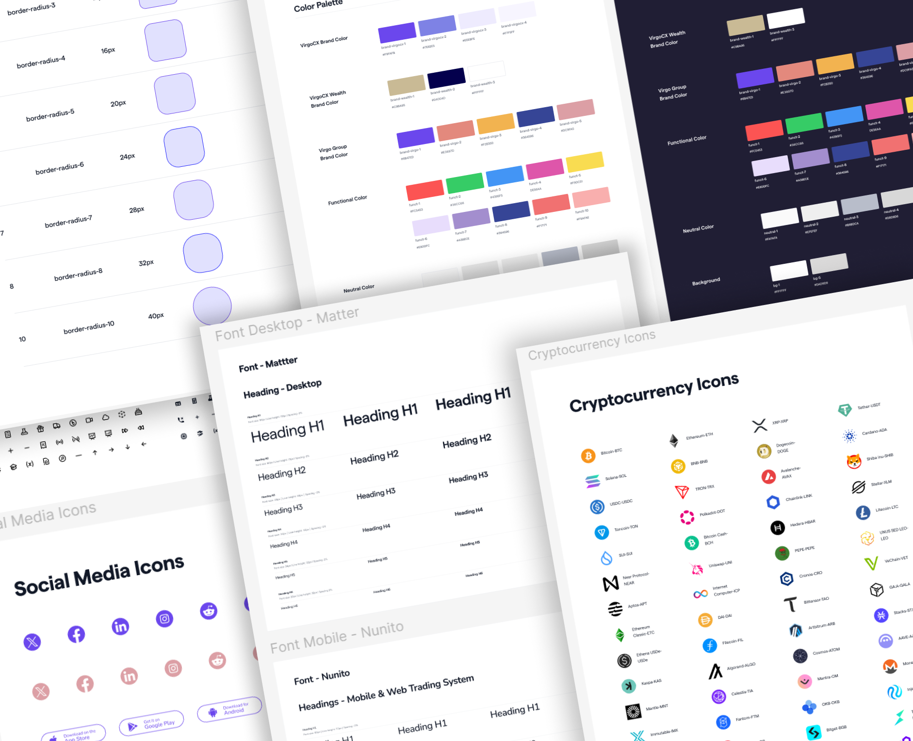
During Gate.io’s UI revamp project, the entire team collaborated to optimize both the website and app from version 2.0 to 3.0.
My group focused on fundamental pages, and I primarily worked on the “My Profile” section and its subpages, including Announcements and Support etc. My responsibilities included applying the new design system, optimizing user flows and information architecture, and collaborating on competitor analysis to enhance the overall UI/UX.
A example of optimization of the My Profile static page in both light and dark mode:


OUTCOMES
Working as part of a large team with many collaborators gave me a great opportunity to experience the working style of Asian companies and understand how teamwork functions in a big organization.
Along the way, I also gained valuable hands-on experience that deepened my skills in both UI and UX design. This project not only expanded my professional abilities but also taught me a lot about effective collaboration and communication in a big team setting.